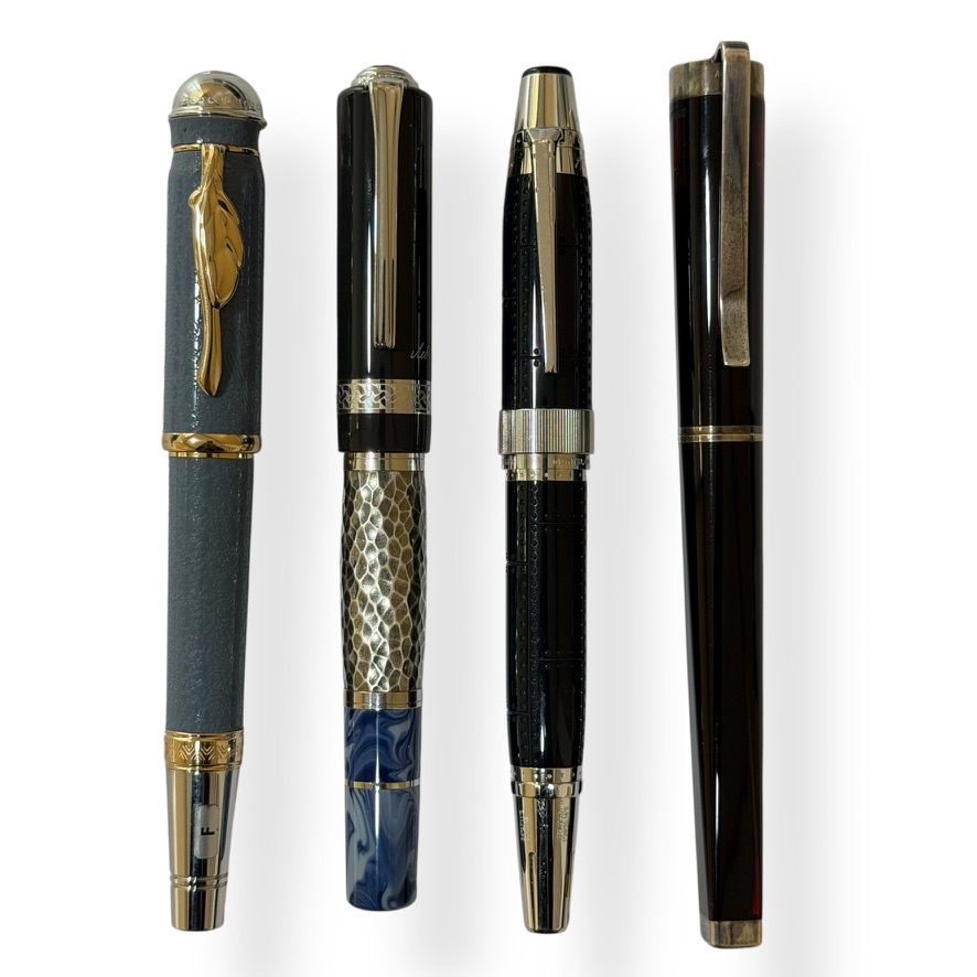
The Montblanc Writers Edition Leo Tolstoy Limited Edition is a profound tribute to the Russian master of realism, whose literary architecture was as vast as the steppe itself. In the lineage of the Writers Edition series, i.e. a collection that seeks to bridge the gap between the tactile act of writing and the philosophical weight of the author, the Tolstoy occupies a position of unique moral gravity. It completes my other Writer Edition collection that includes the architectural complexity of Goethe, the existential transformation of Kafka, and the poetic soaring of Saint-Exupéry. Tolstoy arrives as a grounding force, representing the struggle between aristocratic heritage and a radical, ascetic simplicity.
Lev Nikolayevich Tolstoy (Лев Николаевич Толстой) is most celebrated for the Napoleonic scale of War and Peace and the devastating psychological precision of Anna Karenina. However, this particular instrument draws its deepest inspiration from his later, more introspective works, such as The Death of Ivan Ilyich and Resurrection, reflecting his eventual rejection of worldly wealth. As Tolstoy famously wrote in Anna Karenina, Anything is better than lies and deceit, and this pen embodies that pursuit of truth through a design that prioritises raw texture over polished vanity.
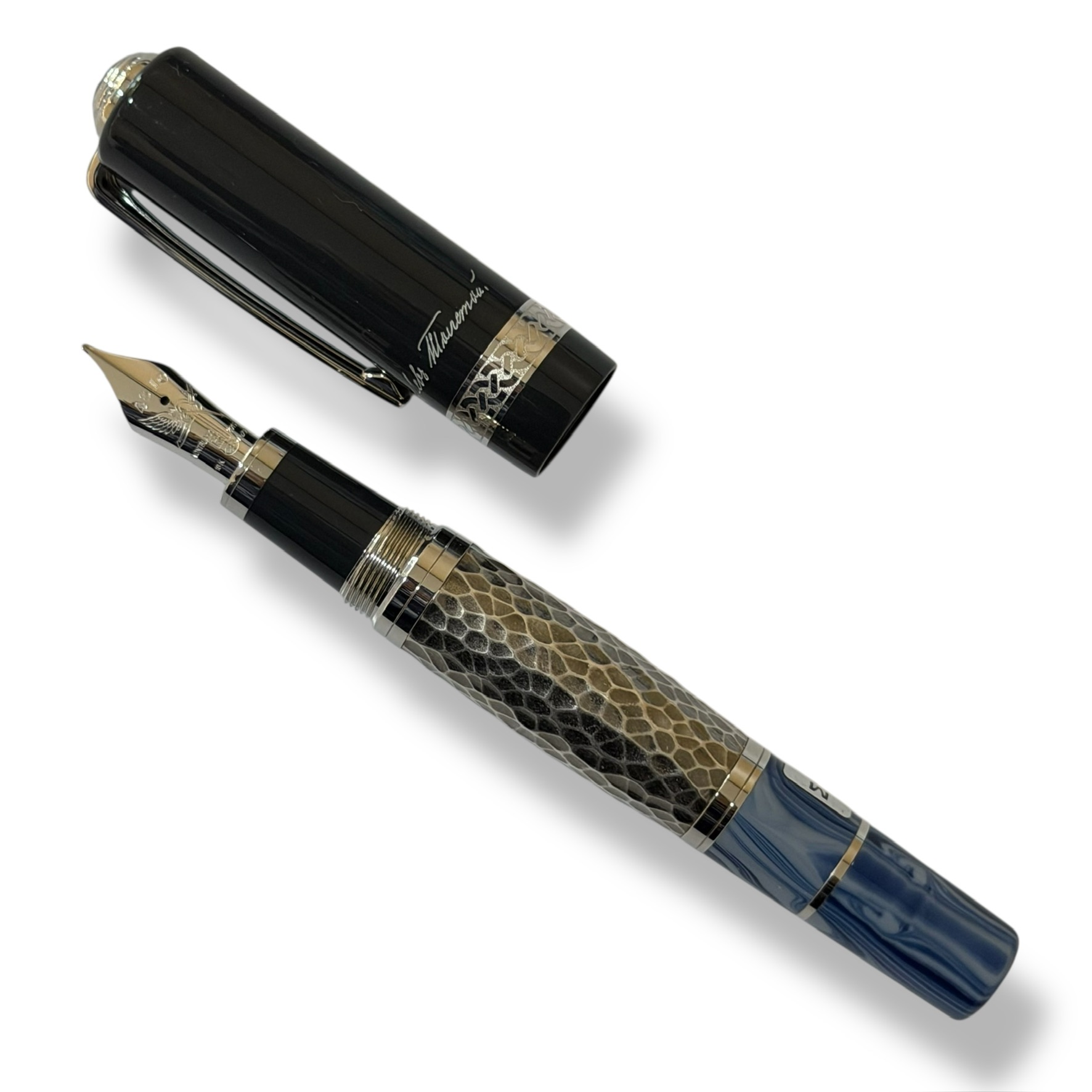
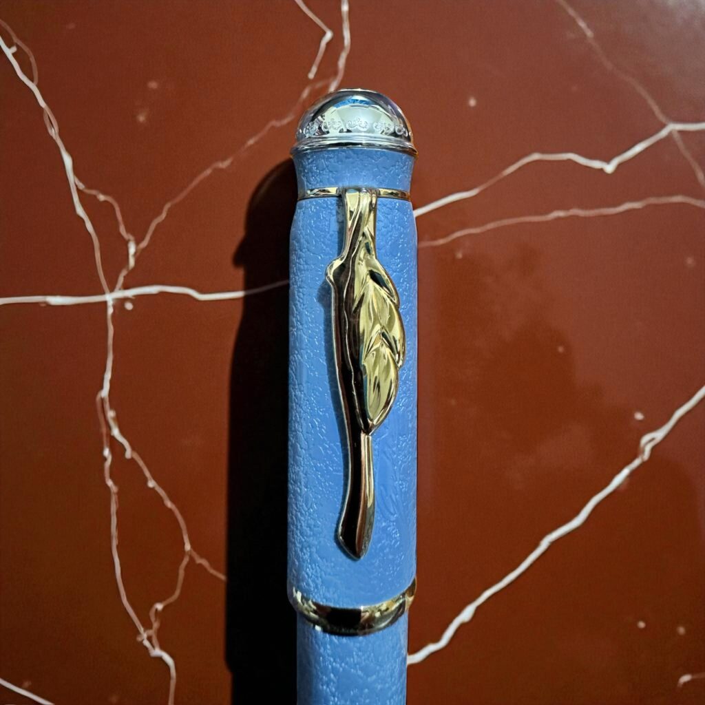
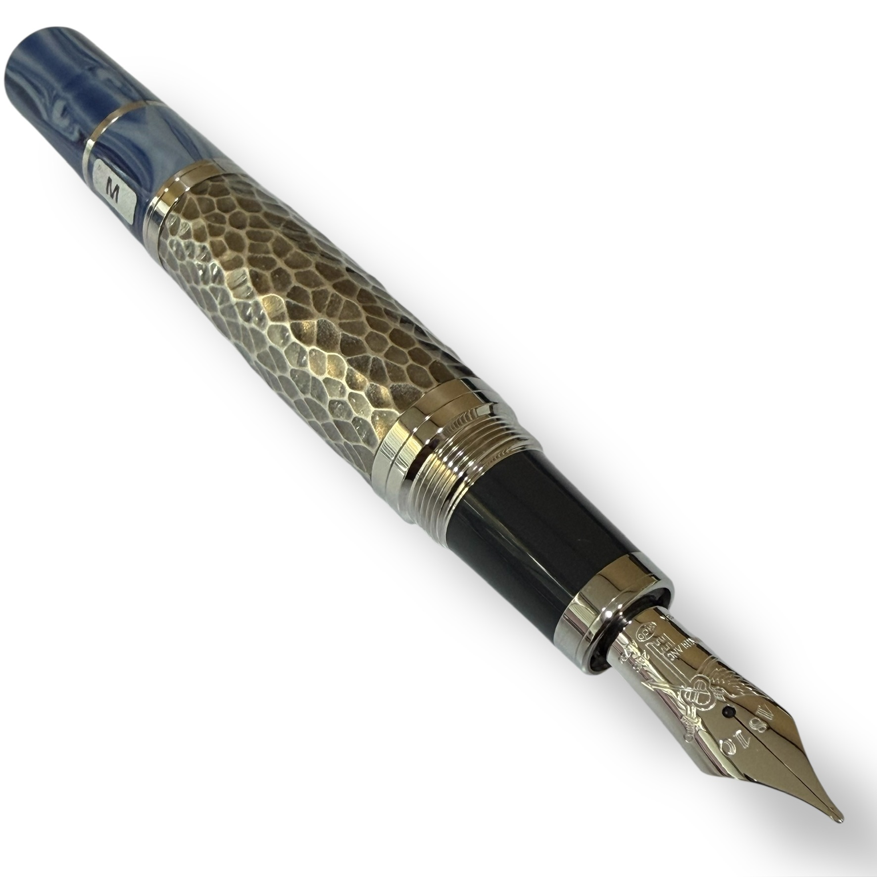
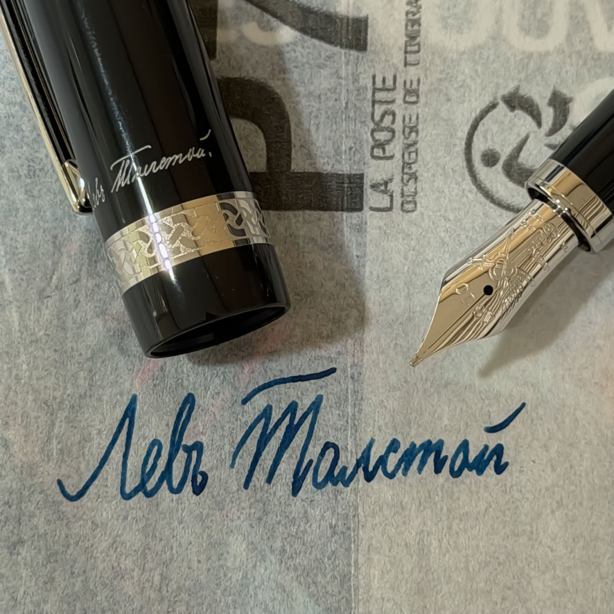
The technical execution of the pen is a sophisticated study in symbolic storytelling. The barrel is crafted from silver-plated metal, uniquely hammered to provide a rugged, tactile surface that honours the manual labour Tolstoy championed at his estate, Yasnaya Polyana. This sits in deliberate contrast to the dark blue precious resin of the cap and the marble-grey resin of the cone: colours that evoke the stoic Russian winters and the modest bindings of his personal library. The cap is further distinguished by the refined engraving of Tolstoy’s own signature, a hallmark of the Writers Edition series that serves as a personal seal of authenticity.
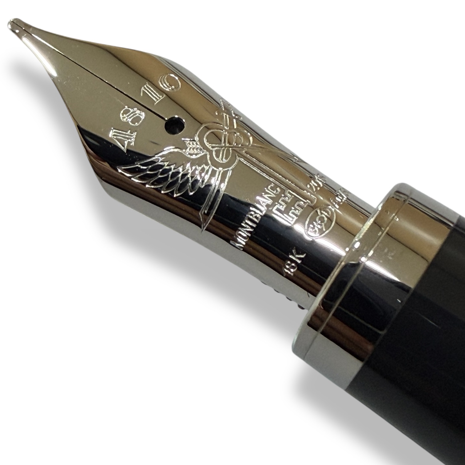
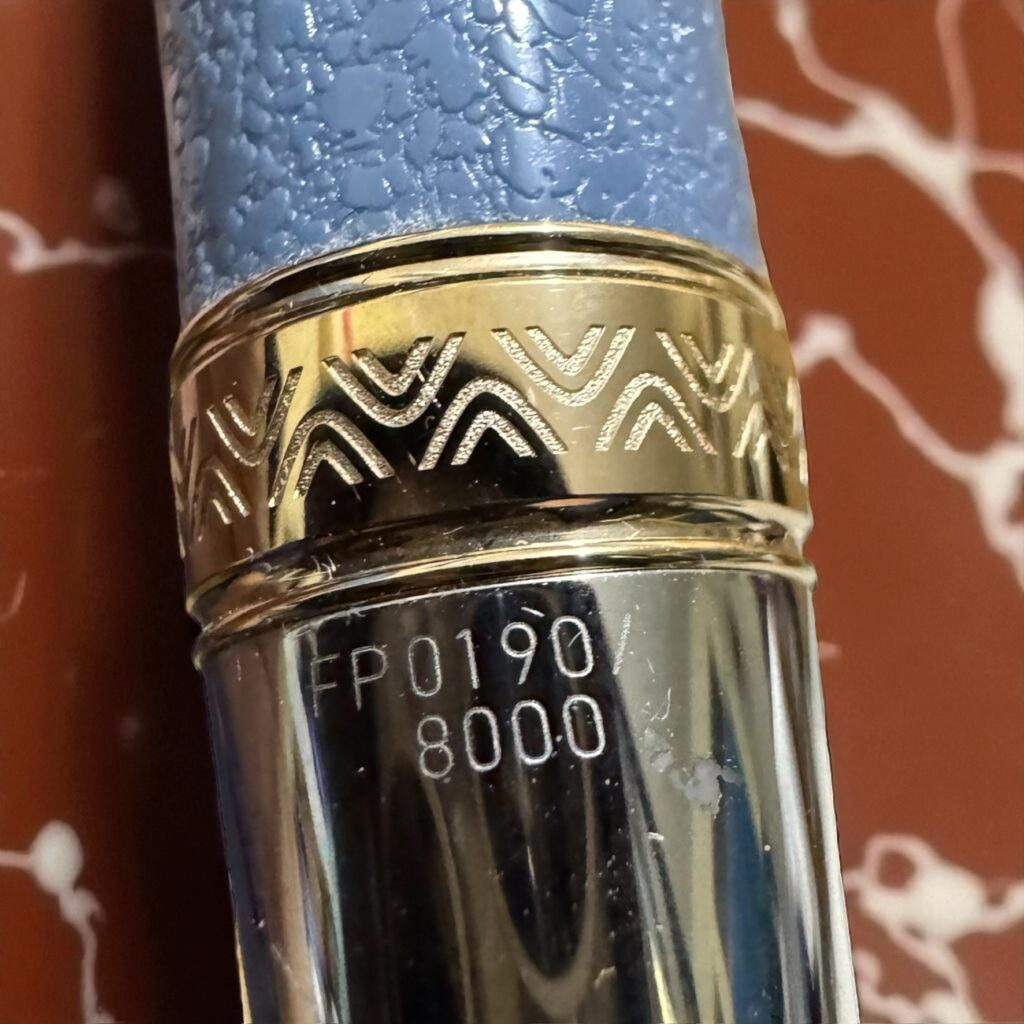
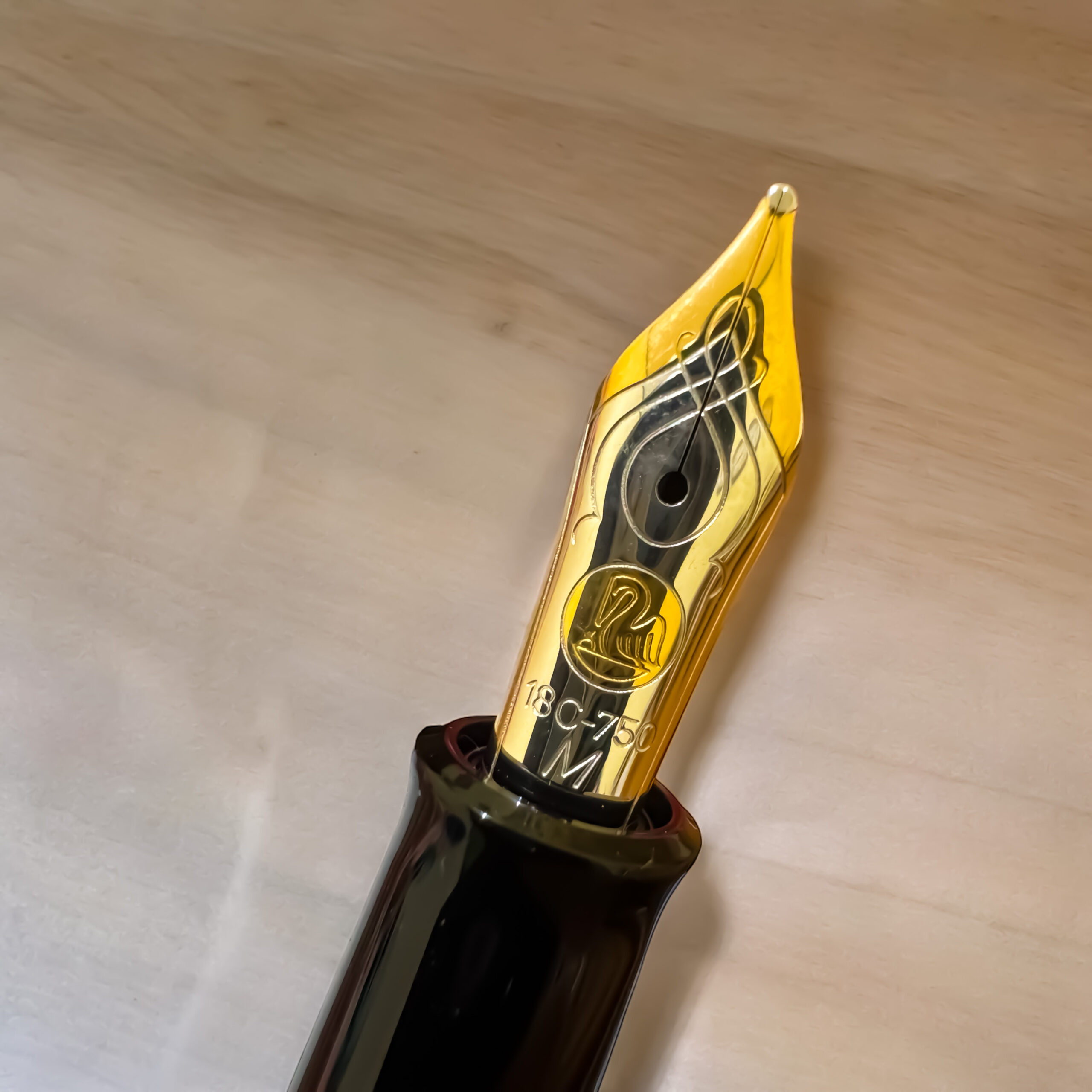
Every aesthetic choice on this fountain pen serves a narrative purpose. The cap ring features a traditional Russian woven pattern, a nod to the folk art of the peasantry whom Tolstoy considered the true heartbeat of the nation. The rhodium-coated Au 750 solid gold nib is perhaps the most significant technical detail; it is intricately engraved with a telega, the humble horse-drawn carriage used by Russian farmers. This detail serves as a functional metaphor for Tolstoy’s life: a journey from the heights of nobility back to the most basic elements of human existence.
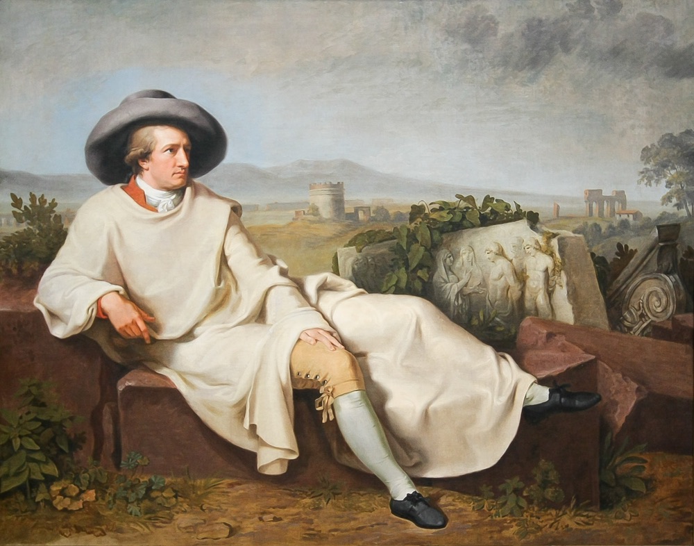
In the hand, the Tolstoy offers a substantial heft, feeling more robust than the metamorphic, silver-trimmed Kafka. It shares the “Grand Old Man of Letters” aura with the Goethe, yet it replaces the latter’s neoclassical elegance with a more rustic, textured dignity. To write with this pen is to be reminded of Tolstoy’s own reflection: “The two most powerful warriors are patience and time.”
++: