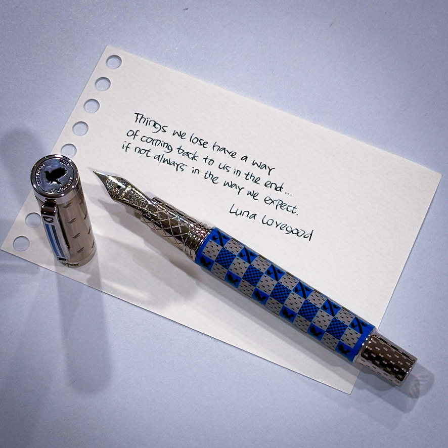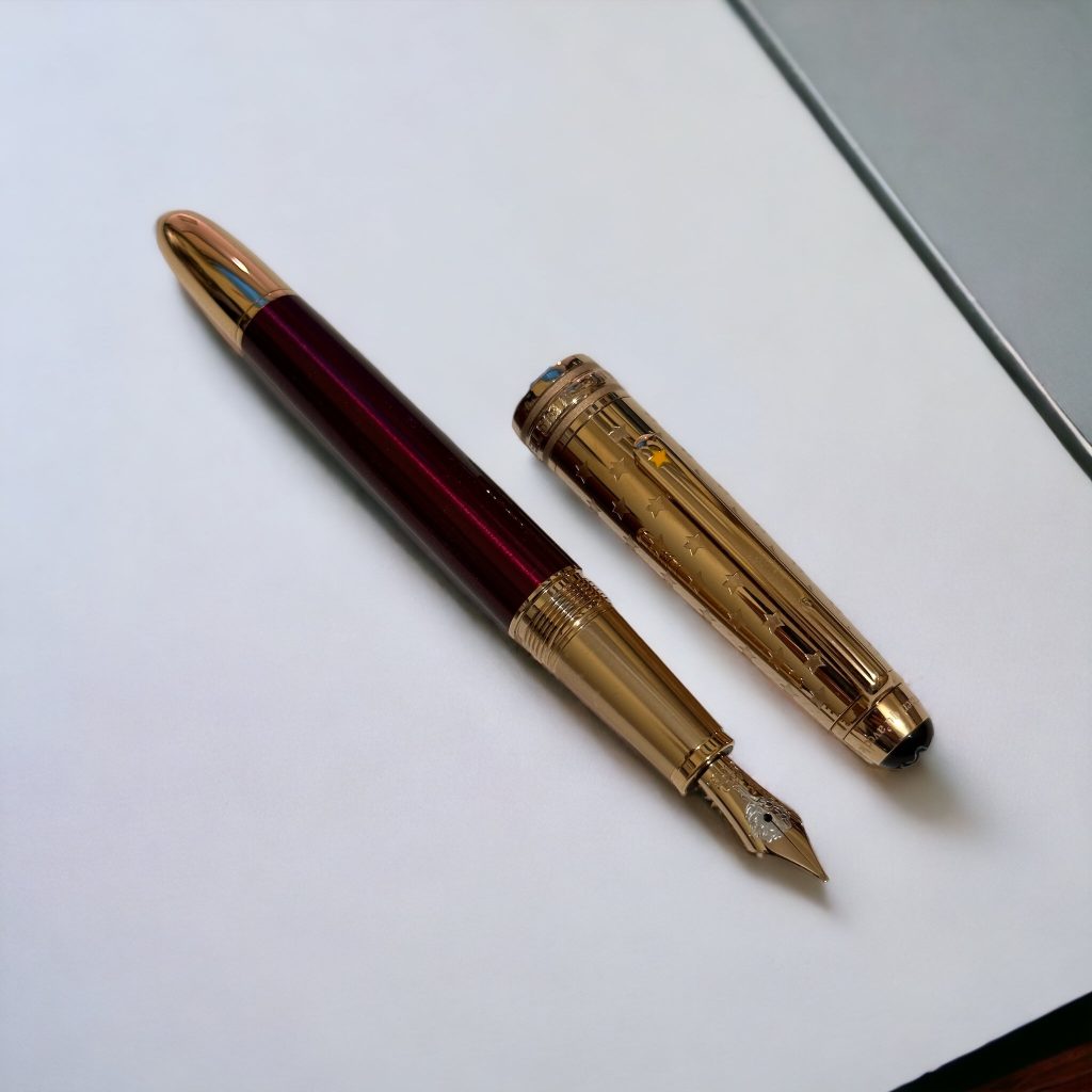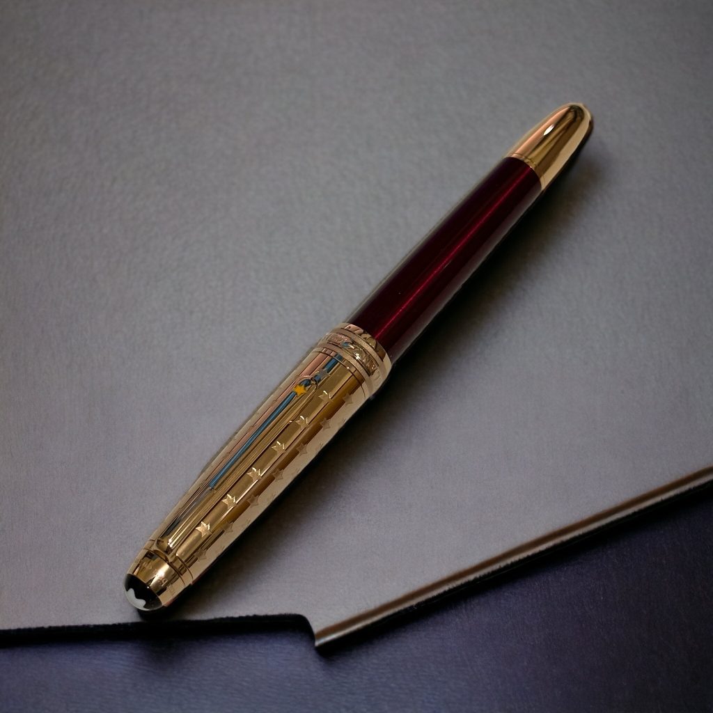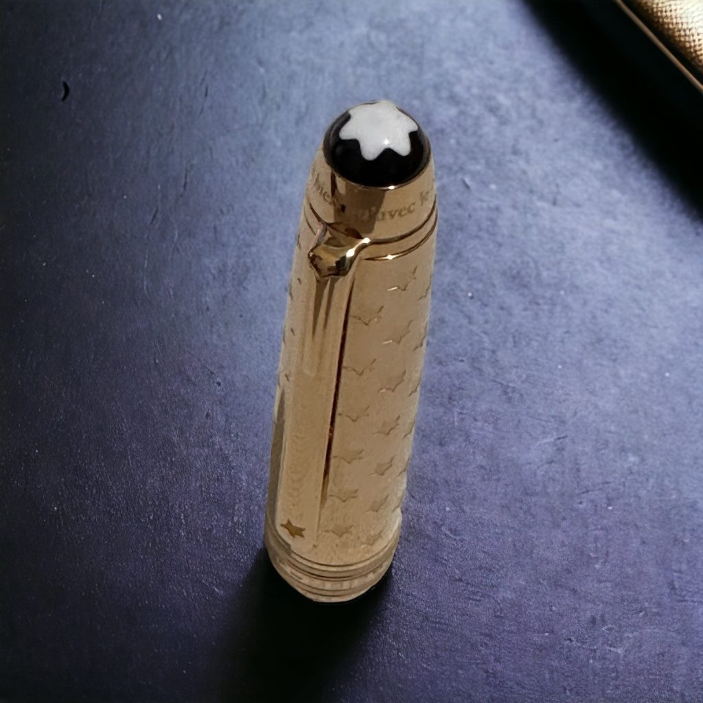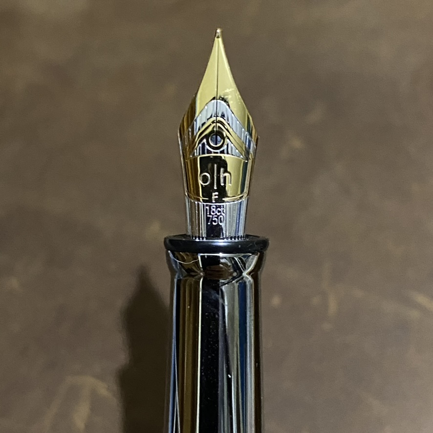
November — one of the most inspiring months, with its dark season in most populated part of the earth. Darkness, reducing the ability to see with our eyes, but opening our heart wider to see the wisdom of our life, of the universe. And at the first week of November, we celebrate Fountain Pen Day. This year, we celebrate it on November 3rd — just between Nov 2nd and Nov 4th for sure. And the pen I choose today is Montegrappa Harry Potter Series: Ravenclaw!

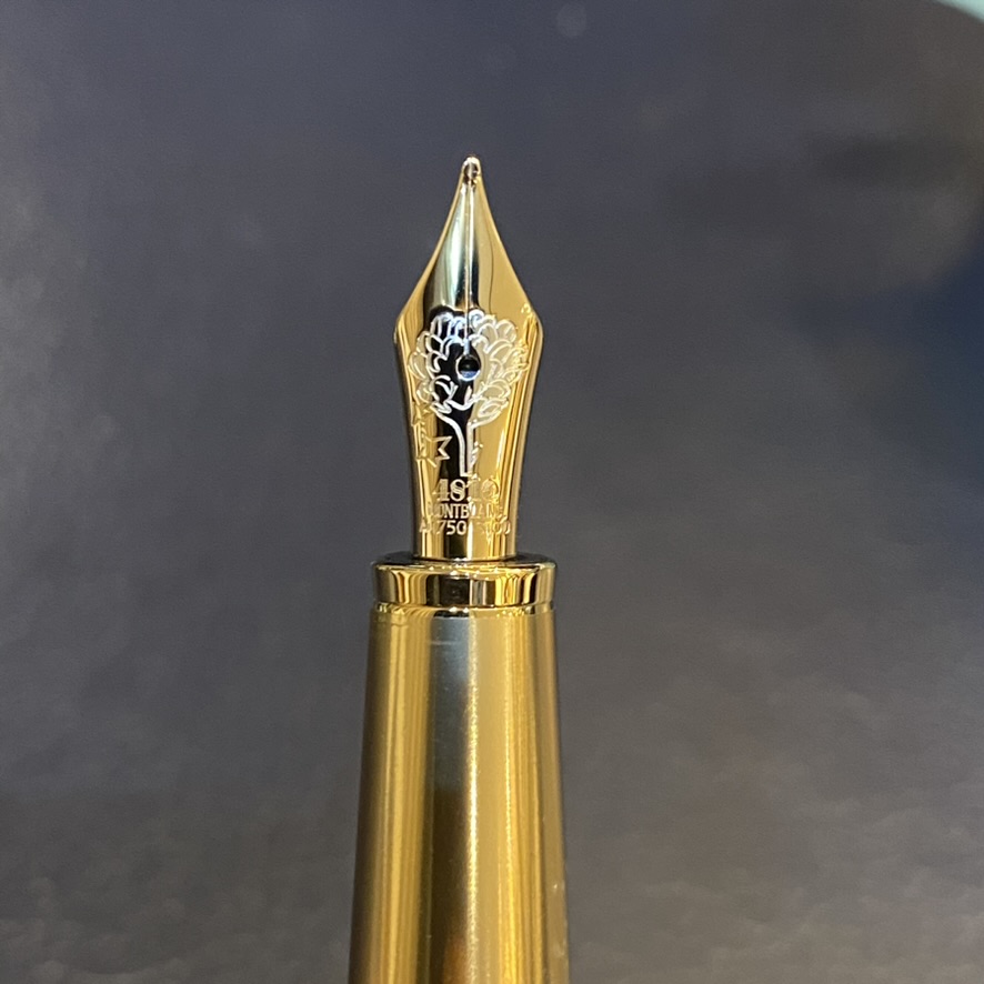
Montegrappa has produced a special edition fountain pen inspired by the Harry Potter series. I have displayed the Gryffindor design last year (URL). Now proudly I show you the Ravenclaw.

At Hogwarts School of Witchcraft and Wizardry, each house has its own unique qualities and values, contributing to the diversity and richness of the Hogwarts student body. In contrast to the other houses (Gryffindor, Hufflepuff, and Slytherin), Ravenclaw stands out for its emphasis on intellectual pursuits and a love of learning.

The unique characteristics of Ravenclaw can be summarised as follows:
- Intelligence and Wisdom: Ravenclaw house values academic achievement and intelligence. Ravenclaw people are known for their intellectual curiosity, love of learning, and a desire to expand their knowledge.
- Creativity and Originality: Ravenclaws are often associated with creativity and original thinking. The house encourages people to think outside the box and approach problems with innovative solutions.
- Wit and Cleverness: Ravenclaws are known for their quick wit and cleverness. They appreciate a sharp mind and the ability to think on one’s feet.
- Love of Learning: Ravenclaw people have a passion for learning and seek to understand the world around them. The house common room, located in a tower on the west side of Hogwarts, is filled with books and is a quiet place to study and contemplate.
- Individuality: Ravenclaws often value individuality and independence. They appreciate uniqueness and are accepting of diverse perspectives and ideas.
- Lack of Prejudice: Unlike some other houses, Ravenclaw is known for its lack of prejudice and acceptance of people from all walks of life, as long as they exhibit the qualities valued by the house.
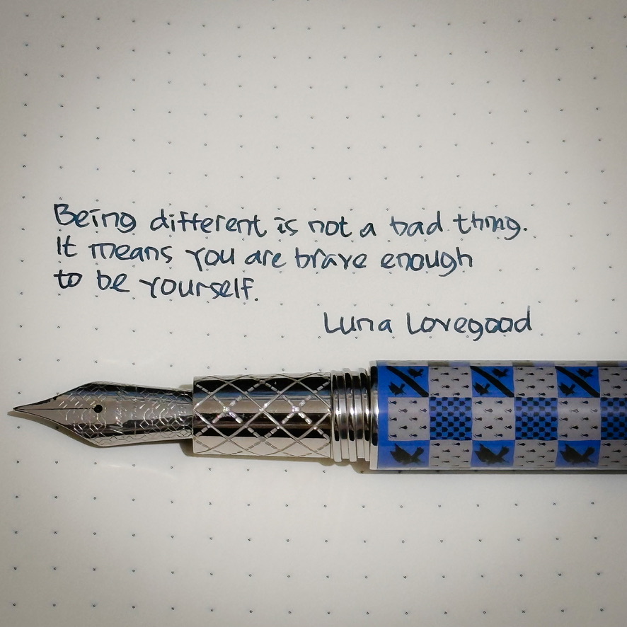
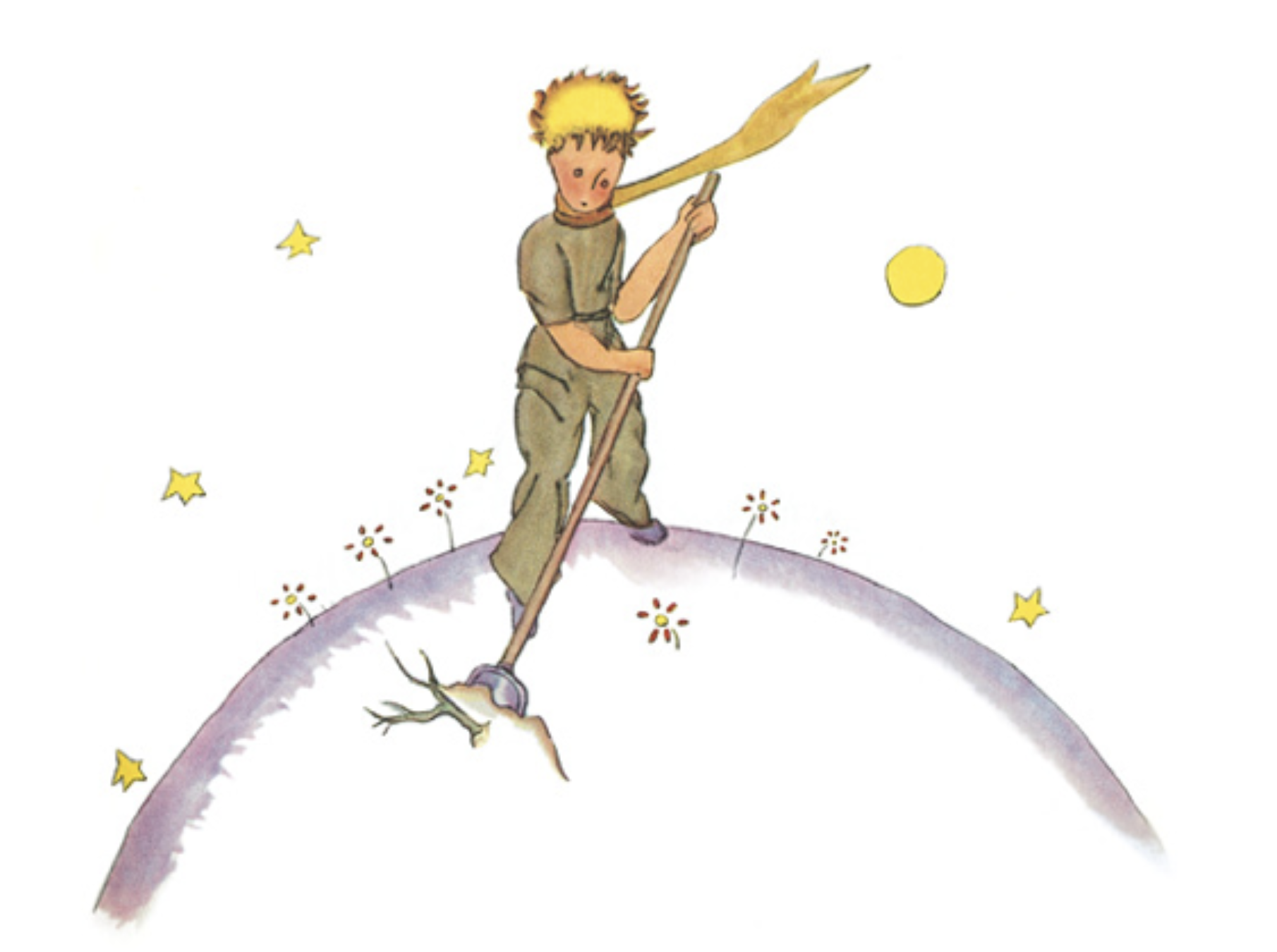
The most prominent Ravenclaw character at the Harry Potter series is surely Luna Lovegood — a beloved character known for her individuality, kindness, and unwavering belief in the magical and mysterious aspects of the wizarding world. The individuality here includes her distinctive quirky appearance and dreamy expression. Luna is portrayed as open-minded, kind-hearted, and unapologetically herself. She is not easily affected by the opinions of others and remains true to her beliefs and values.

Luna is often considered eccentric by her peers, but she is comfortable in her uniqueness. But her loyalty, bravery, and willingness to fight for what she believes in are evident during the final intense and dangerous confrontation of the series — making her one of the most important character of the story.