University of Cambridge — Onoto

The University of Cambridge has a rich history that spans more than 800 years. Its origins can be traced back to 1209, when a group of scholars migrated to establish ofa new centre of learning in Cambridge. By 1231, the institution received a charter from King Henry III, which granted it significant privileges. This charter marked the beginning of the university’s official recognition and its rise as a prominent academic institution.

The university is organised into a series of colleges, with the first college, Peterhouse, founded by Hugh de Balsham in 1284. Each college is an independent institution with its own property and income, but all are part of the university, contributing to its rich academic and cultural environment.
The university played a significant role in the Renaissance and the Scientific Revolution. Notable alumni include Sir Isaac Newton, who developed the principles of modern physics in the 17th century while at Cambridge. In the 20th and 21st centuries, Cambridge continued to expand and evolve, becoming a globally recognised and respected institution for higher learning and research. It has maintained a strong emphasis on scientific research and innovation, contributing to technological advancements and the development of new fields of study. Today, this university consists of over 30 colleges and numerous academic departments, faculties, and schools. It continues to be a leading centre for education and research, attracting students and scholars from around the world. The university’s commitment to excellence in education, research, and contribution to society remains steadfast, ensuring its place among the top universities globally for years to come.

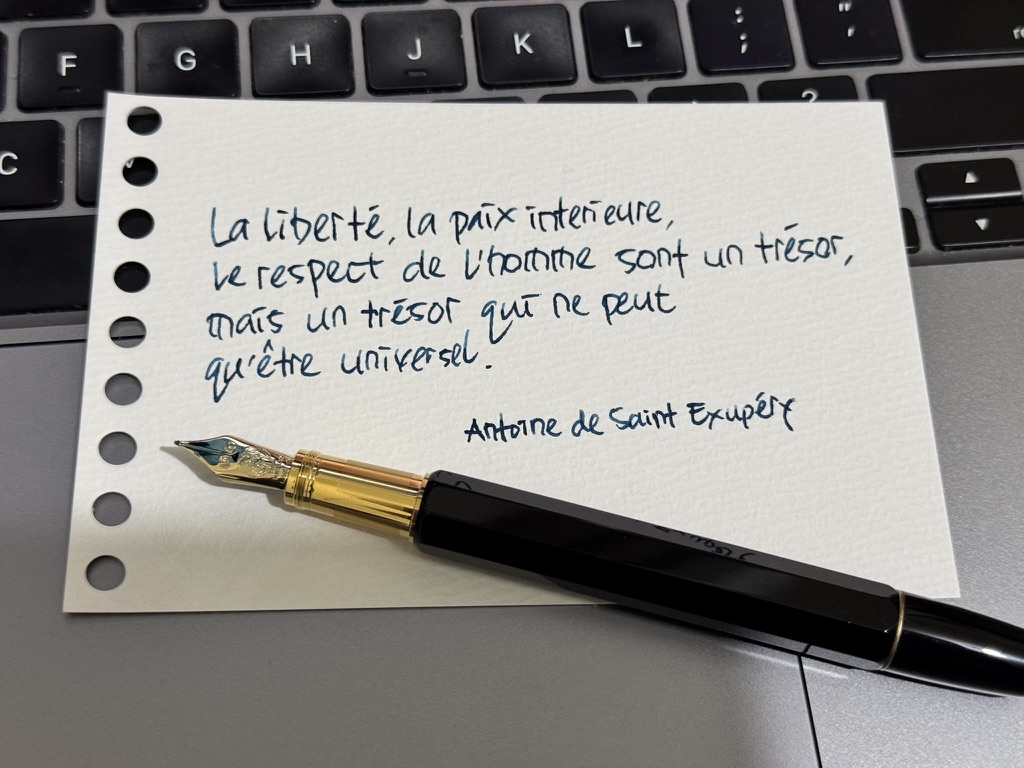
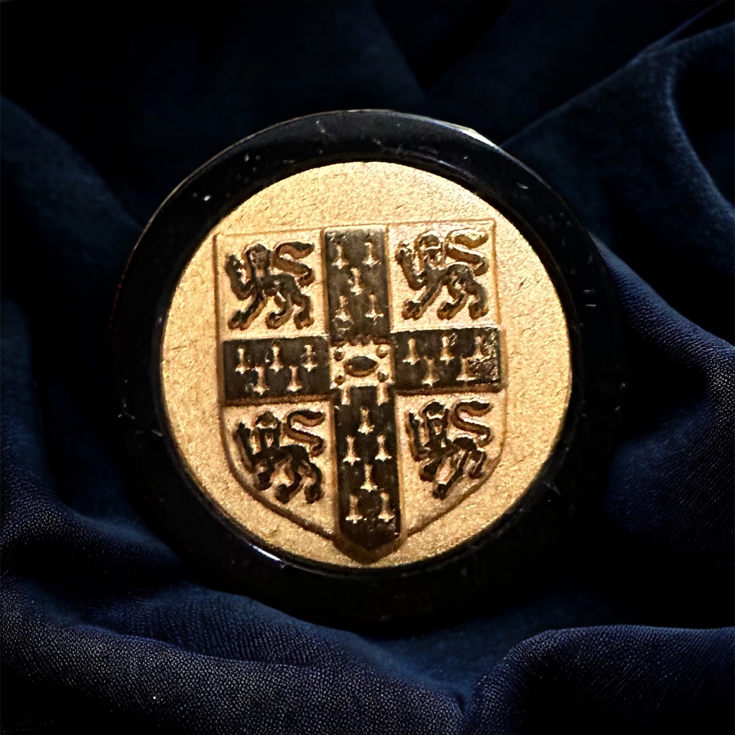
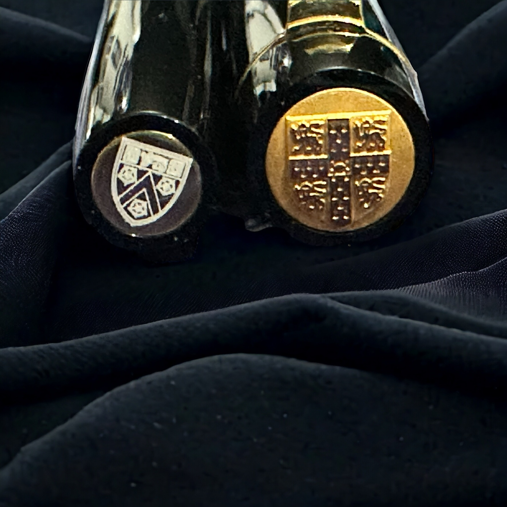
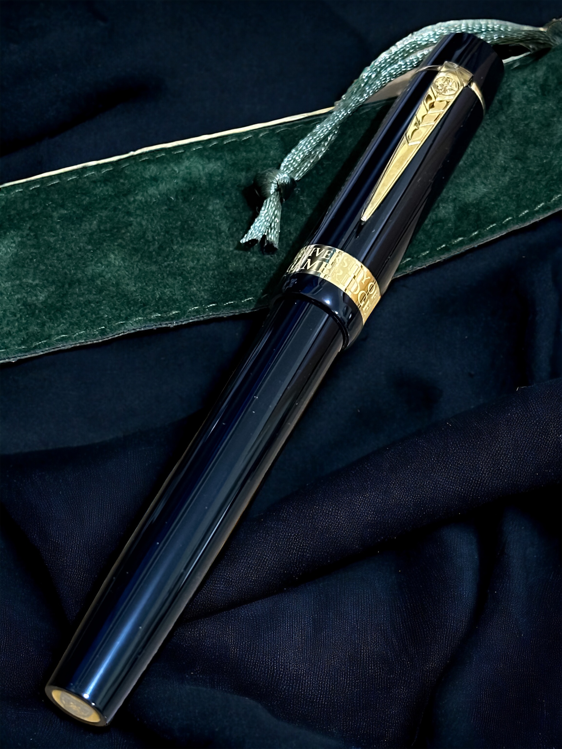
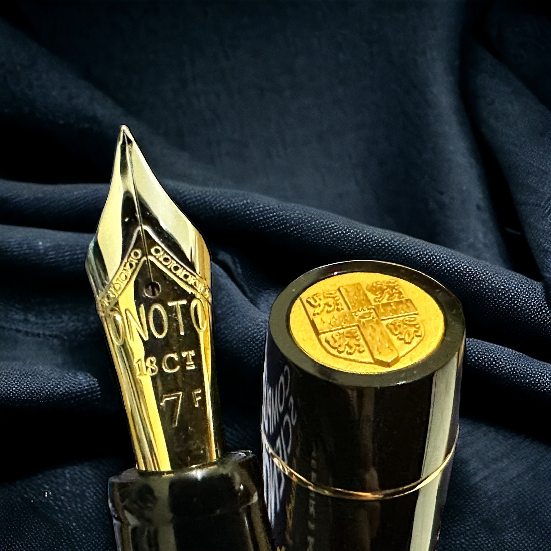
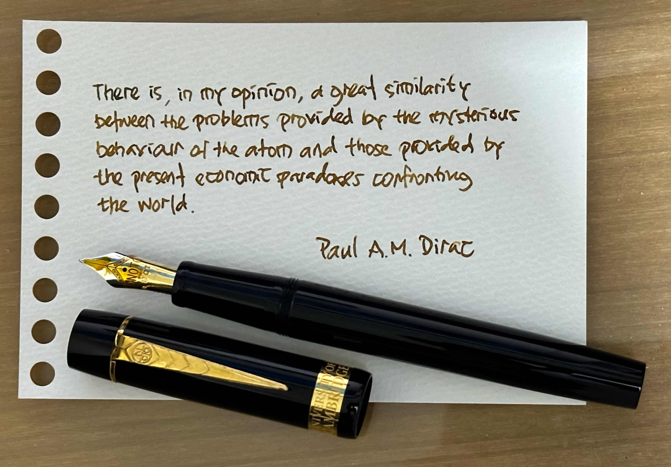
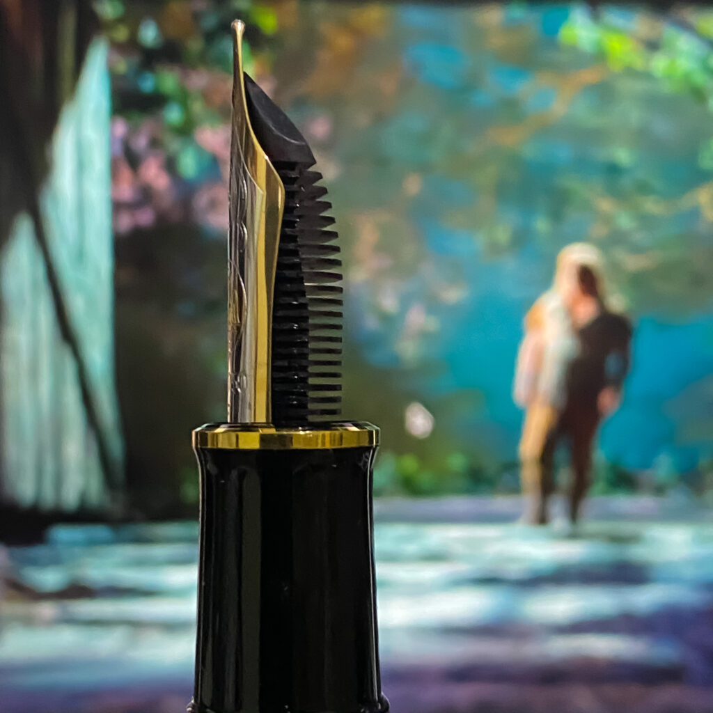
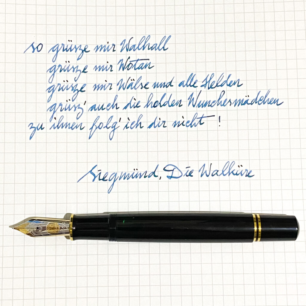
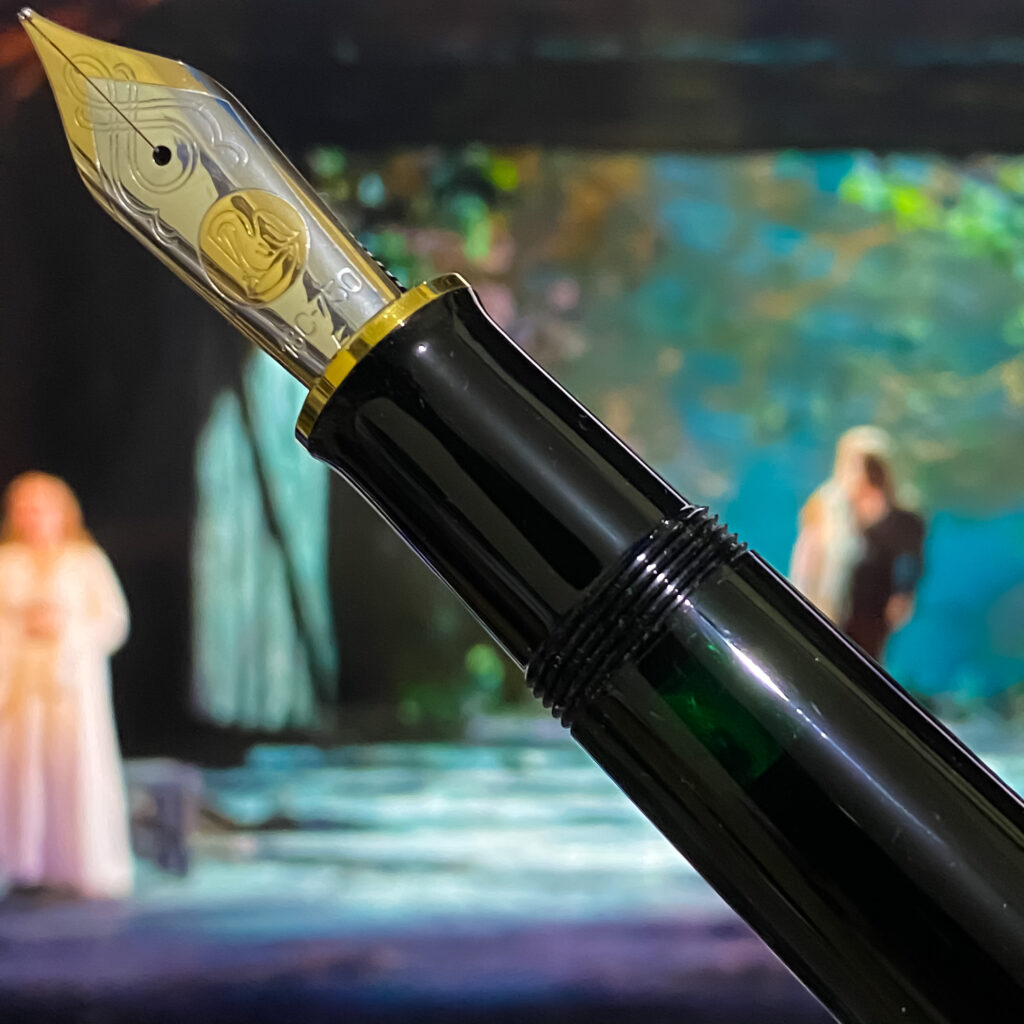
I have an Onoto fountain pen designed for the University of Cambridge. It is a Magna Black & Gold model with the logo of this university on its crown, and a Trinity College crest; with Au750 F-sized nib. It is my second Onoto after the one designed for Oxford University.

Onoto, a prestigious brand of fountain pens from the United Kingdom, has a rich history and a strong reputation for quality, innovation, and cultural significance. The brand’s journey began in the early 20th century, making it an integral part of the fountain pen industry’s history and development. Its history dates back to 1905 when the brand was established by Thomas De La Rue & Co. The first Onoto pen, the Onoto Patent Self-filling Pen, was launched in 1905 and quickly gained fame for its innovative plunger-filling system, which was a novelty at the time. This filling mechanism allowed for a more straightforward and cleaner way to refill the pen, setting Onoto pens apart from their competitors.

Onoto pens are renowned for their high quality, craftsmanship, and durability. The brand has consistently emphasized the production of pens that are not only functional but also beautiful, often using precious metals, high-quality resins, and intricate designs. Collectors and users of Onoto pens value them for their smooth writing experience, balance, and the tactile pleasure they provide. In the 21st century, Onoto has experienced a revival, appealing to both collectors of vintage pens and enthusiasts of luxury writing instruments. The brand continues to produce limited editions and bespoke pens, often commemorating significant historical and cultural events, further enhancing its cultural significance and appeal to connoisseurs of fine pens.

Le Petit Prince #3 — Montblanc

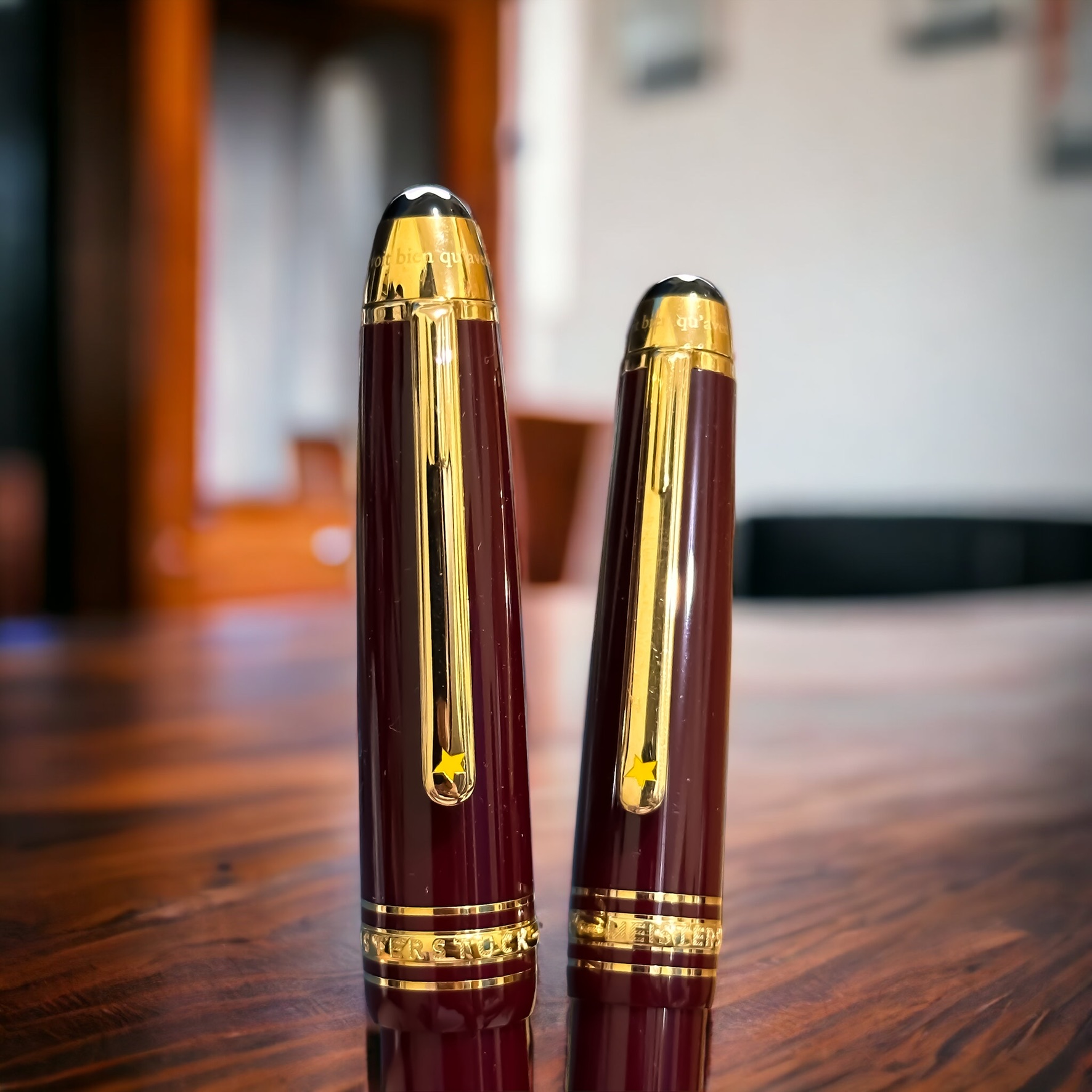
As a personal joke, I call it an example of a cognitive dissonance, or specifically on the aspect of cognitions importance — the greater the perceived value of something, the greater the magnitude of the dissonance in the relation. The dissonance on the importance values result sometimes in unpredictable things. An example is the activity of collecting fountain pens (in the 21st century nonetheless). Another example is the cohesion to the books and other artefacts related to Le Petit Prince. That is the reason that I choose this very day to exhibit another, or two other, artefacts from both collections: Montblanc, Le Petit Prince Series of the 3rd Year, in burgundy.

I have also explored my other Montblanc pens collection related to Le Petit Prince:

Obviously, I skip MB The Meisterstück Le Petit Prince #3 on purpose — albeit an inapparent reason.

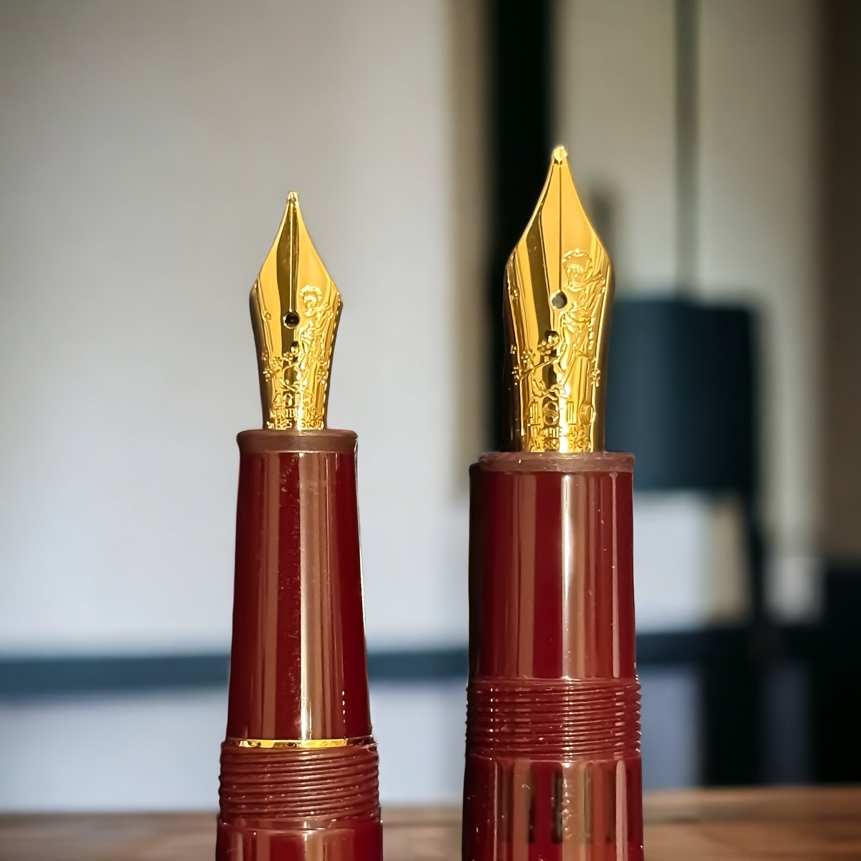
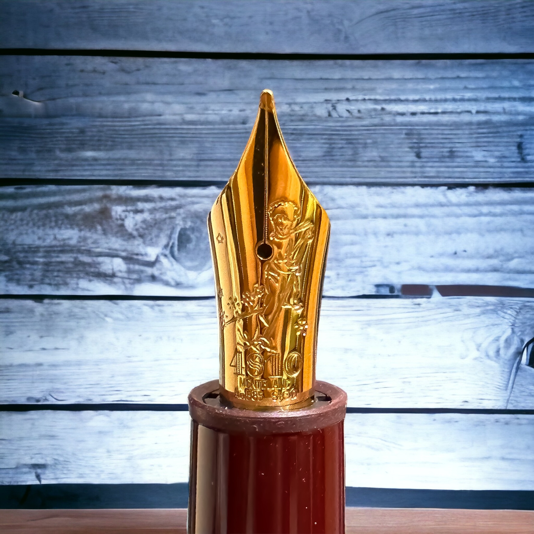
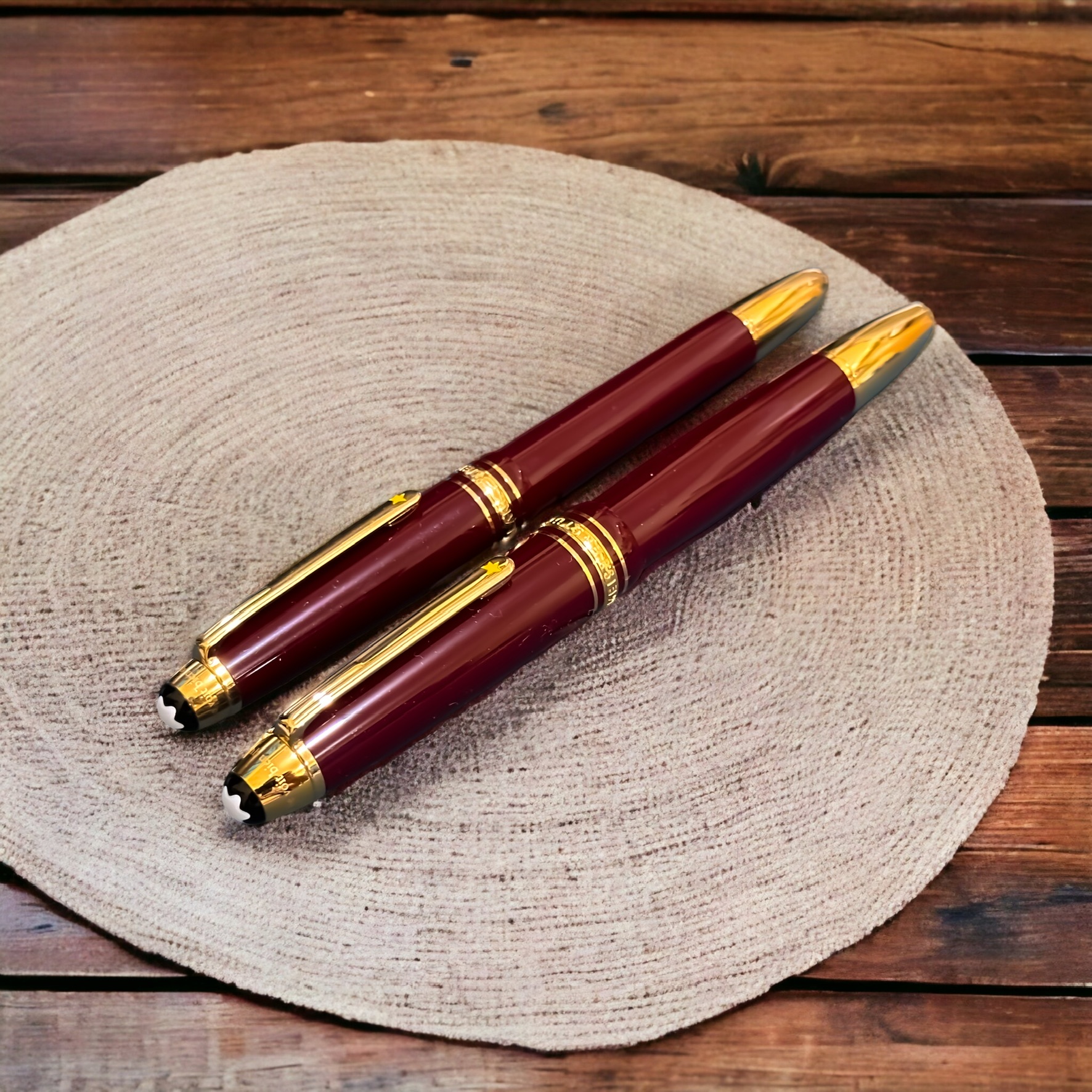
This Montblanc LPP Series #3 were launched in 2020, with burgundy colour, and with gold nibs (Au 585) carved with The Little Prince cleaning his planet from the sprouts of bad seeds. The Chapter 5 of Le Petit Prince book describes on the little prince’s planet, as on all planets, there were good plants and bad plants, and so of course there were good seeds from the good plants, and bad seeds from the bad plants. But seeds are invisible. They lie dormant hidden deep in the dark of the earth until one of them has the notion it would be a good idea to wake up. This little seed will first have a stretch, then grow slowly, ever so slowly, up towards the sunlight, until at last there it is, a sweet little innocuous twig of a plant. If it is the first shoot on a radish perhaps, or the early sprig of a rose, then it can be left to grow on as it wishes. But if this is a bad plant, you should pull it up at once, the moment you recognise it for what it is. “It’s just a question of self discipline,” the little prince explained later.

I have two size of this excellently designed pen: Le Grand (146 size, above) and the Classique (145 size, below). The Meisterstück 146 is larger and has a slightly thicker barrel compared to the Meisterstück 145. The 146 is often considered a full-sized pen, while the 145 is slightly smaller and more compact. Both have similar nib design, albeit with obviously different size, and consequently different detail. The 146 has an internal piston, while the 145 is equipped with a cartridge.

Having two fountain pens with different size and similar design makes it easier to compare the experience of using these quite standardised pen (in term of size). Since the Meisterstück 146 is larger, it tends to be slightly heavier than the Meisterstück 145. The weight difference is generally not substantial, but some individuals may have a preference for either a lighter or heavier pen. While both pens offer a smooth writing experience, some users find that the larger size of the Meisterstück 146 provides a more comfortable grip and balance. However, this can vary based on personal preference and hand size.

The the previous Le Petit Prince -themed pens, these pens were designed in collaboration with Antoine de Saint-Exupéry’s Estate. Le Petit Prince, authored by Antoine de Saint-Exupéry, is a beloved and timeless literary work that has captivated readers worldwide. Montblanc’s collaboration with the Estate of Antoine de Saint-Exupéry allows them to pay homage to the author and his iconic characters while creating a special connection with literature enthusiasts and fans of Le Petit Prince.

Surely we are all curious that Montblanc released three different pen designs related to Le Petit Prince in three consecutive years. Or four, if the pen released in 2017 to commemorate Antoine de Saint-Exupéry is also counted. But releasing the pens in different colours each year has successfully created a sense of exclusivity and limited edition allure. It can also incentivise collectors to acquire all three pens (at least), appealing to the desire to complete a set or collection. This approach allows Montblanc to tap into the passion and enthusiasm of collectors who seek to possess the entire series. Each new colour or design release also keeps the story and its themes fresh in the minds of fans, fostering a continued connection with the narrative. And this is why I started it with a mention of cognitive dissonance.

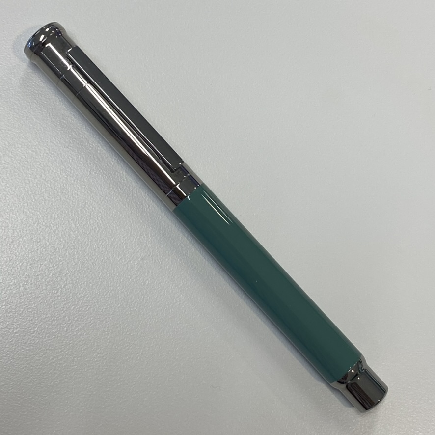
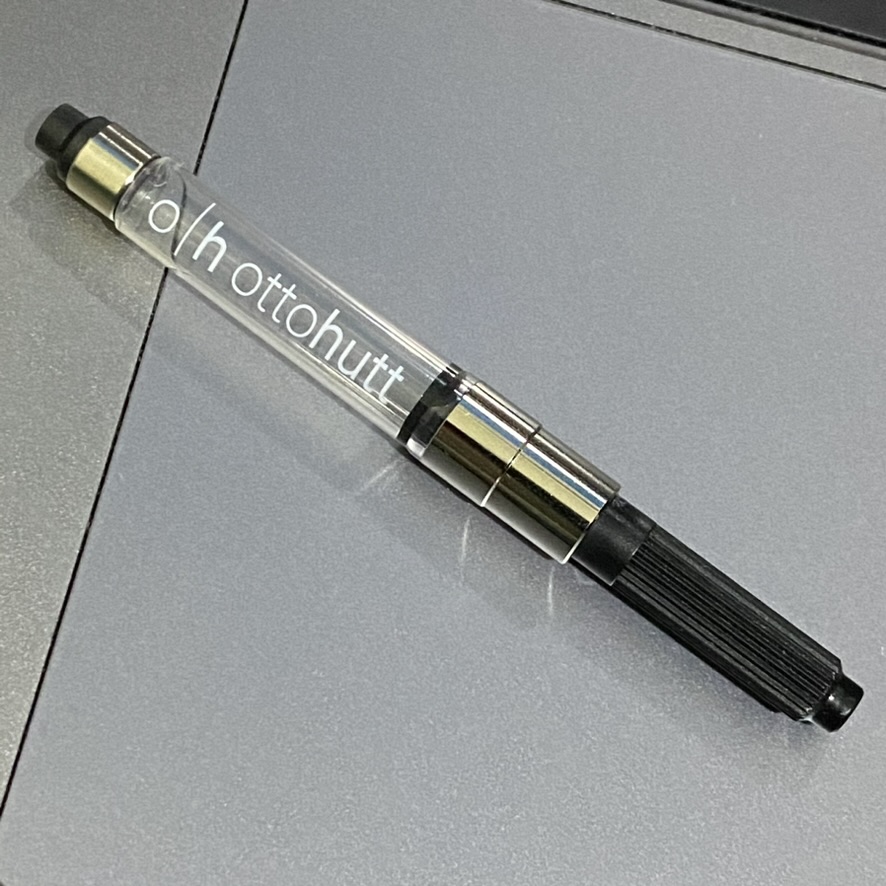
Otto Hutt Design 04

Otto Hutt Design 04 is a notable and highly regarded series of writing instruments by the German manufacturer Otto Hutt. Introduced in 1999, Design 04 has become synonymous with the brand’s commitment to craftsmanship, innovative design, and luxurious aesthetics.

Otto Hutt is a German manufacturer known for producing high-quality writing instruments, including fountain pens. The company was founded in 1920 by Karl Hutt in Pforzheim, Germany. Initially, the company focused on creating jewelry and accessories, including gold and silver pens. During the 1950s, Otto Hutt expanded its production to include more affordable writing instruments while maintaining its dedication to quality. The company incorporated advancements in pen technology and materials, such as the use of new plastics and metals, to cater to a wider market. In the 1990s, Otto Hutt underwent a significant transformation under the leadership of Dr. Christa Hutt, the granddaughter of the founder. Driven by a vision of combining traditional craftsmanship with contemporary aesthetics, she revitalised the brand’s focus on luxury pens. This led to the introduction of the “Design 04” series in 1999, which gained widespread acclaim for its sleek and innovative design.

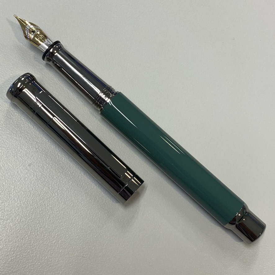
The Design 04 series is characterised by its sleek and modern design, combining clean lines with sophisticated details. It uses premium materials — the collection includes options crafted from precious metals, such as sterling silver and gold, as well as high-quality lacquers and resins. These materials not only enhance the pen’s aesthetic appeal but also contribute to its durability and longevity. The Design 04 pens are available in a range of finishes, allowing users to select a style that suits their personal preferences. Some of the finishes include precious metals with polished or brushed textures, vibrant lacquers in various colors, and elegant combinations of materials. The finishes are meticulously applied to ensure a flawless and visually captivating appearance.

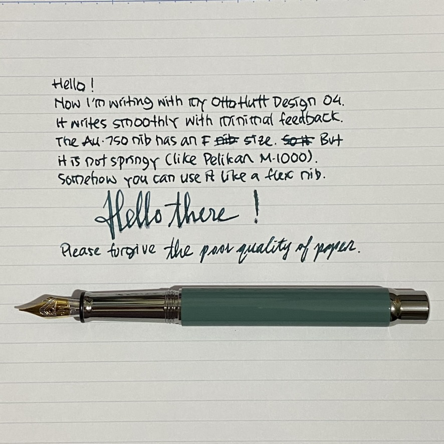
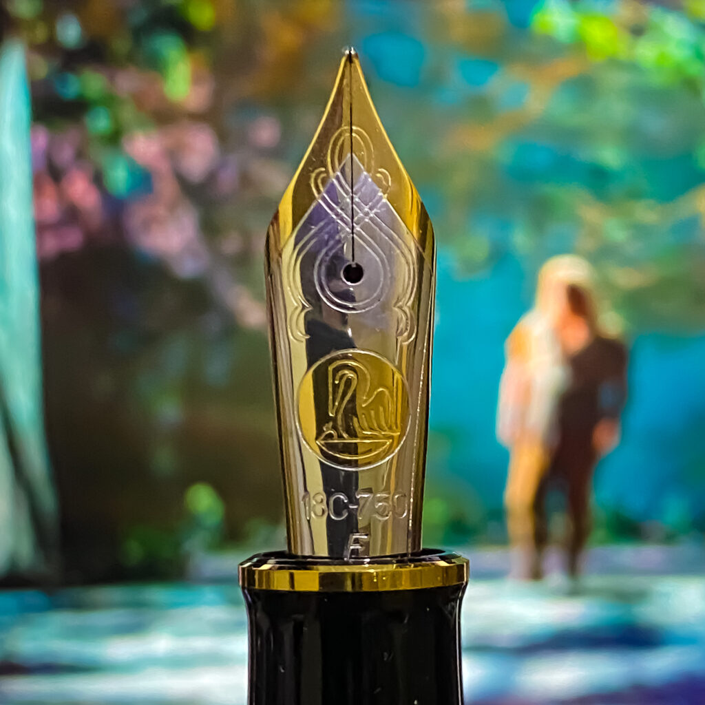
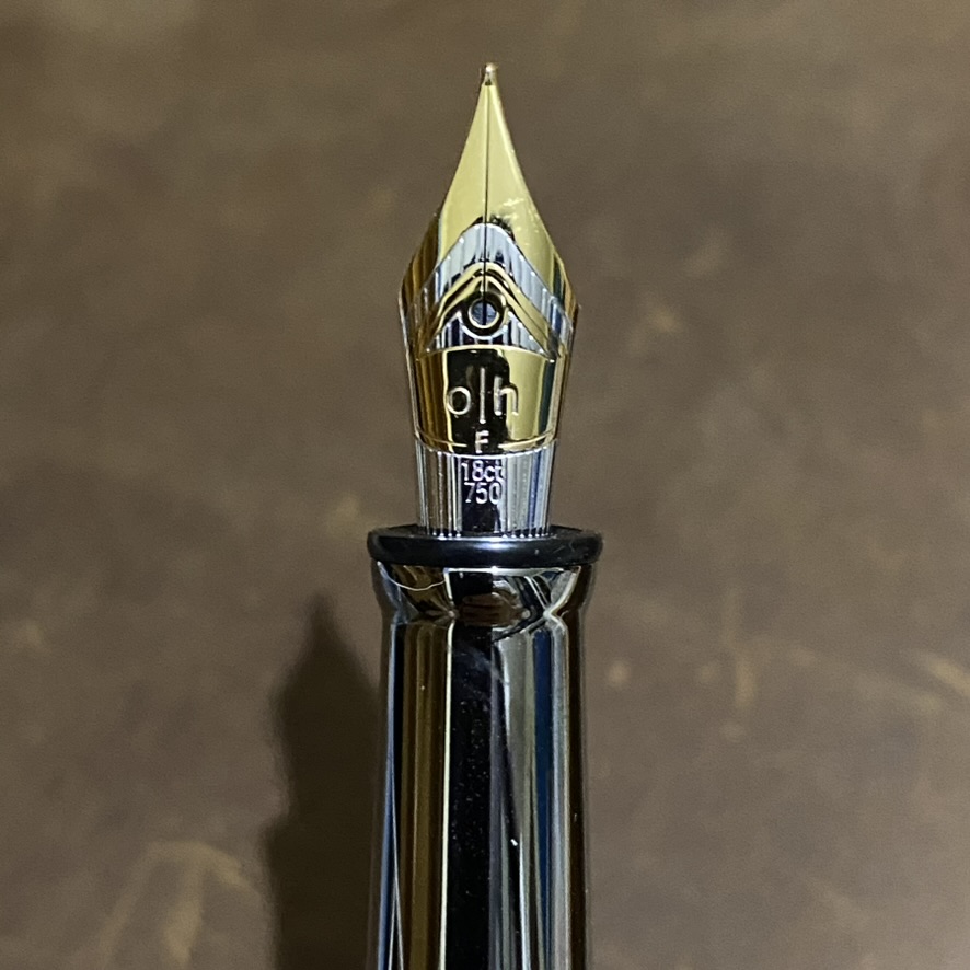
The Design 04 series offers a selection of finely crafted nibs, designed to deliver an exceptional writing experience. The nibs are available in different materials, such Au750 (18k gold) shown here, and in various widths to cater to individual writing preferences. Each nib is carefully tuned to provide smooth and consistent ink flow, resulting in effortless and enjoyable writing.

Otto Hutt is known for its attention to detail, and the Design 04 series exemplifies this commitment. From the precision-engineered threads to the meticulously finished clips and accents, every aspect of the pen is thoughtfully designed and executed.

Pelikan Souverän M1000

For the International Handwriting Day today I will display Pelikan M1000 as one of the best pens I have (considering, though, that almost all my pens are the best pens). This pen is the top member of the Pelikan Souverän family. This family consists of the M3xx, M4xx, M6xx, M8xx, and M10xx — with the higher numbers before xx are related to the increase in size. So this Souverän M1000 is also the flagship pen of Pelikan.


This pen has a gigantic nib made of Au750 — and it is virtually a perfect 18C gold that it writes so smoothly with the effect of a flexible nib. We can compare it with the magnificent Montblanc Meisterstück 149 with flex nib. Both have an Au750 nib. But not all 149 nibs are designed as flex nib — only those that are advertised so. So both writes excellently well for flexible nib effect. But then when we use them for simple signature, M1000 can simply transform to a cool signature pen, whle 149 flex would lose its magic without its flex effect. It means, to replace an M1000, I’d need a 149 with flex nib and another 149 without flex nib. But surely others may have different experiences.


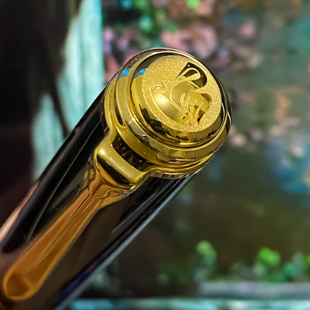
M1000 has some alternative designs. But for the sake of why not and mwahahahahaha I have chosen a perfect black M1000 with golden cap and ring. Now I have more collection for my gold banded black pen. The barrel and the cap of the pen are made of cotton resin. The cap features a 24k gold-plated finial with a laser-etched relief logo of a pelican and its chick. This pen has an 18k gold bib.

Pelikan’s nib is so breathtaking. It has a unique design: a long and slender nib, with narrower shoulders and a shallower curvature. The face of the bi-color nib is stamped with a series of intersecting, graceful, swooping curves. The Pelikan logo is stamped in the middle of the nib face.

Some dimensions:

  • Length (capped): 145.6mm
  • Length (uncapped): 135.1mm
  • Length (posted): 173.6mm
  • Section diameter: 12.1mm
  • Barrel max diameter: 13.8mm
  • Cap max diameter: 16mm
  • Weight, uncapped (with ink and/or converter): 25g
  • Weight, capped (with ink and/or converter): 35g

Writing using M1000 giving a wet effect of the ink — a favourite for a calligrapher. But, no, it is very wet — but somehow I like it. The big nib is springy, allowing to make line variation as we wish. Again, it is a favourite for a calligrapher.

Pelikan is a 190 year old manufacturer of stationeries. It launched its first fountain pen in 1929. Pelikan is also credited as the pioneer of piston filling mechanism with a differential spindle gear aims to overcome the ink capacity issue in fountain pens. Hungarian engineer Theodor Kovacs is credited with the invention of the original filling mechanism before selling off the patent to Günther Wagner in 1927.

Yes, another Wagner. I know.

Gershwin’s Rhapsody in Montblanc

Rhapsody in Blue — a composition I used to wake myself up for years. As if understanding how hard it is to start a day, it starts with a slow and random clarinet melodies. But then it raises to an orchestra with dynamic harmonies to absorb the spirit with no stop to our soul. And that is how life used to begin for years.

Its composer, George Gershwin (September 26, 1898 – July 11, 1937), was an American composer and pianist whose compositions spanned both popular and classical genres. Besides Rhapsody in Blue, his best-known works are an orchestral work An American in Paris (1928), the jazz standard I Got Rhythm (1930), and the opera Porgy and Bess (1935) which gave birth to the hit Summertime.

Montblanc has an annual tradition to launch donation pen collection for honouring world-famous classical musicians. This program supports selected cultural projects from pioneering artists the world over with a donation of 20 euros per fountain pen (and 10 euros per ballpoint or rollerball). The edition of 2019 paid the tribute to George Gershwin.

The design of Gershwin fountain pen is quite distinctive — easily recognised. The clip is in the shape of a clarinet — a tribute to the clarinet opening from Gershwin’s Rhapsody in Blue. Another tribute to Rhapsody in Blue is the ink window which features a blue colour. The cap ring is inspired by the Brooklyn Bridge to symbolise the close relationship George Gershwin had with his place of birth. The cap and barrel are made out of black resin combined with platinum-coated fittings. The length of the pen with the cap is 15.6 cm, and the total weight is 89.84 grams.

Parker Duofold

This year the world commemorate 75 years of the end of the World War II. After the surrender of the German on June, Japan decided to surrender on August, due to the continuous defeat at the Pacific theatre, the dropping of two atomic bombs in Hiroshima and Nagasaki, but especially by the declaration of war and attacks from Russia. Like Germany, Japan chose to surrender to the US rather than being occupied by Russia. Hey, those mad Russians had even murdered their own Tsar on World War I and almost all of their own heroes just before the World War II..

Now, please forget those clumsy Russias with their bad fountain pens (at that time), and focus to the US. Dwight D. Eisenhower and Douglas MacArthur were US Generals with quite different personalities, but — being American patriots — they both used the same brand of pen for the surrender documents 75 years ago. Eisenhower had chosen Parker 51, but MacArthur preferred to use Parker Duofold. Eisenhower’s Parker 51 was used to sign the German Instrument of Surrender in Reims (07 May 1945). MacArthur used a Parker Duofold to sign the Japanese Instrument of Surrender on the deck of the USS Missouri (02 September 1945). Both were two of the most popular pens of their time. But the Duofold was a design that was 20 years older than the 51.

Parker started producing Duofold in 1921. It was a large pen compared with other pens at the time. Almost all other pens at the time were black, but Duofold was available in a bright red/orange color. Even at the USS Missouri, there were multiple pens used to sign the multiple copies of the Japanese Instrument of Surrender — all were standard black pens, except that one Duofold.

The Duofold design is based on the era of Jazz and Art Deco and reflects the abundance and style of the time. It is actually a collection of writing instruments with exceptional character and outstanding design. The Duofold pen is available in 3 sizes, the large Centennial, classical International, or the smaller Demi. The one displayed here is a Parker Duofold Centennial, launched to celebrate 100 years of Parker pens, i.e. in 1988. Crafted from solid acrylic with highly distinguished, contrasting contrasting platinum details. The pen has an 18 kt gold nib in F sizes.

Some dimensions info:
Weight 28 gram
Length closed 135mm
Length barrel 127mm
Length posted 172mm
Diameter 13mm

Now I need to know — besides the usual arrow design of Parker pens — the story behind the ace of spade symbols on both the nib and the cap of this great pen.

Franz Kafka — Montblanc

Franz Kafka (3 July 1883 – 3 June 1924) was a Bohemian author, widely regarded as one of the major figures of 20th-century literature. His work fuses elements of realism and the fantastic. It typically features isolated protagonists facing bizarre or surrealistic predicaments and incomprehensible socio-bureaucratic powers. It has been interpreted as exploring themes of alienation, existential anxiety, guilt, and absurdity. His best known works include Die Verwandlung (The Metamorphosis), Der Process (The Trial), and Das Schloss (The Castle).

In 2004, Montblanc has launched a special edition for Franz Kafka. The design of the fountain pen of this series is not only reminiscent of the simple and yet artful style of its eponym, but also pays tribute to Kafka’s The Metamorphosis. In the fascinating change from square to round in the writing instrument’s form, the metamorphosis described in Kafka’s story has found its equivalent.

Top, clip and rings made of 925 sterling silver offer a thrilling contrast to the dark red translucent aura of the barrel. A further reference to The Metamorphosis is on the rhodium-plated 18-karat gold nib: a finely engraved cockroach.

Die ungeheure Welt, die ich im Kopfe habe. Aber wie mich befreien und sie befreien, ohne zu zerreißen. Und tausendmal lieber zerreißen, als in mir sie zurückhalten oder begraben. Dazu bin ich ja hier, das ist mir ganz klar

Franz Kafka 21-06-1913