Egyptomania

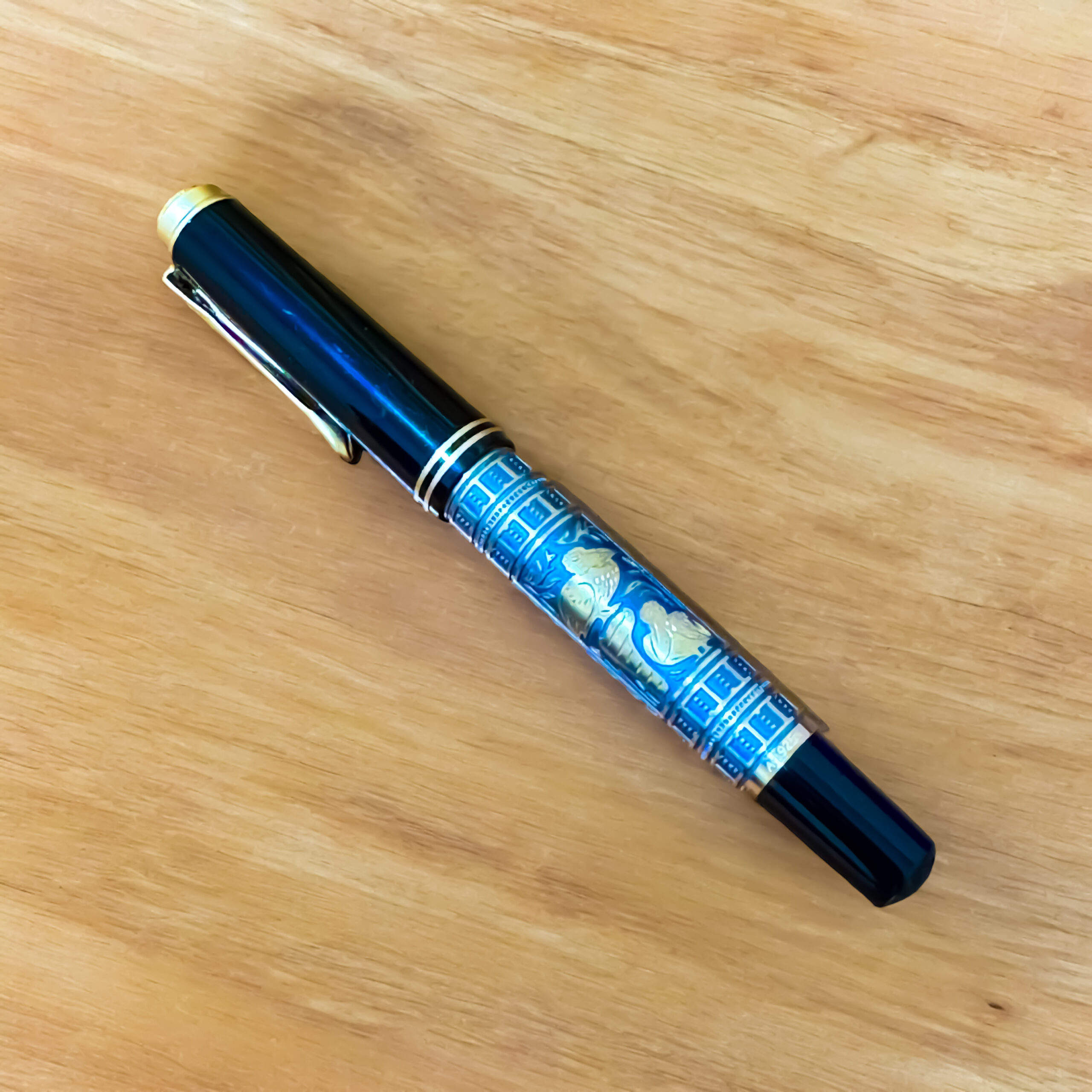
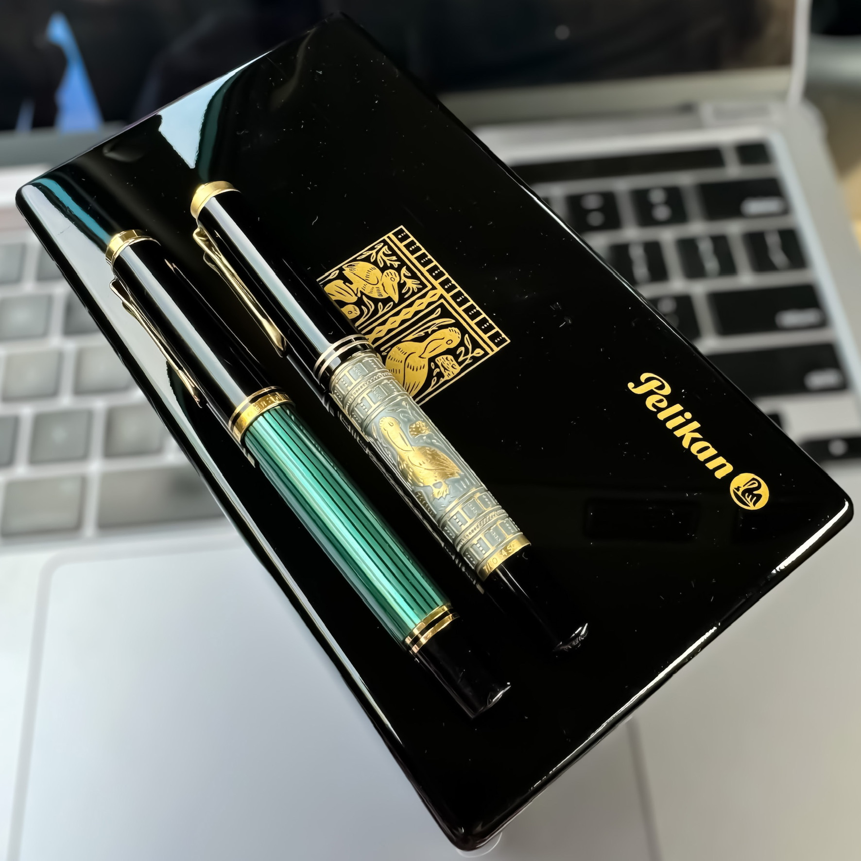
The Montblanc Heritage Egyptomania fountain pen is a refined tribute to the enduring mystique of ancient Egypt—its geometry, its symbols, and its sense of permanence. Inspired by the design codes of the 1920s, yet with a distinctly modern execution, the pen pays homage to a time when egyptology captivated the world. This fascination, often referred to as egyptomania, surged after the discovery of Tutankhamun’s tomb in 1922, and Montblanc’s pen reflects this spirit not through overstatement, but with a quiet, intelligent elegance.

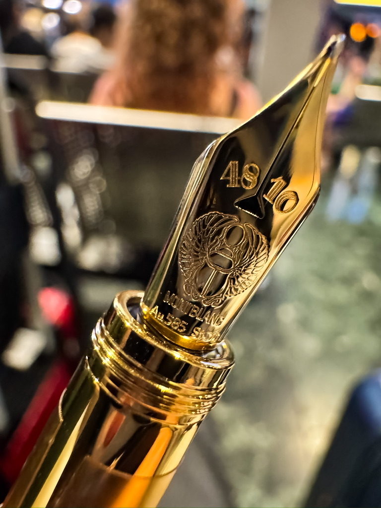
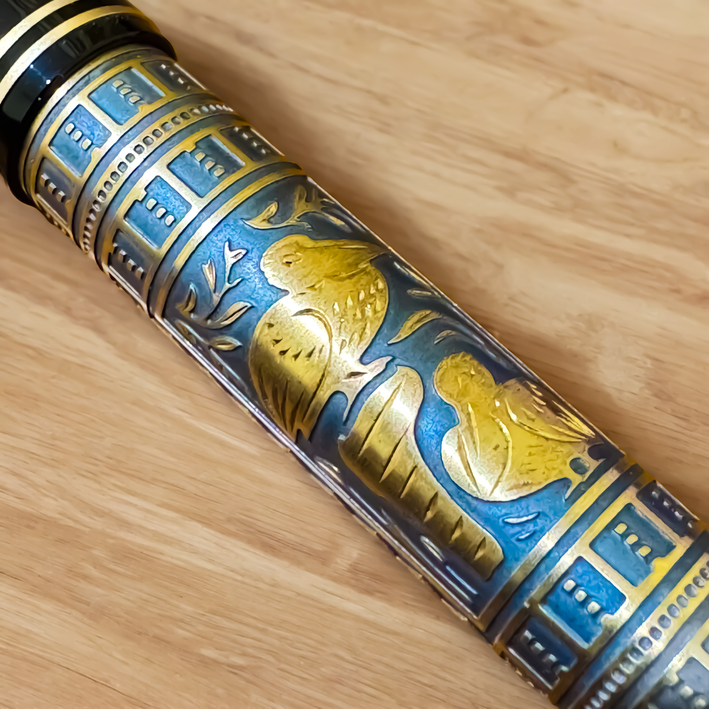
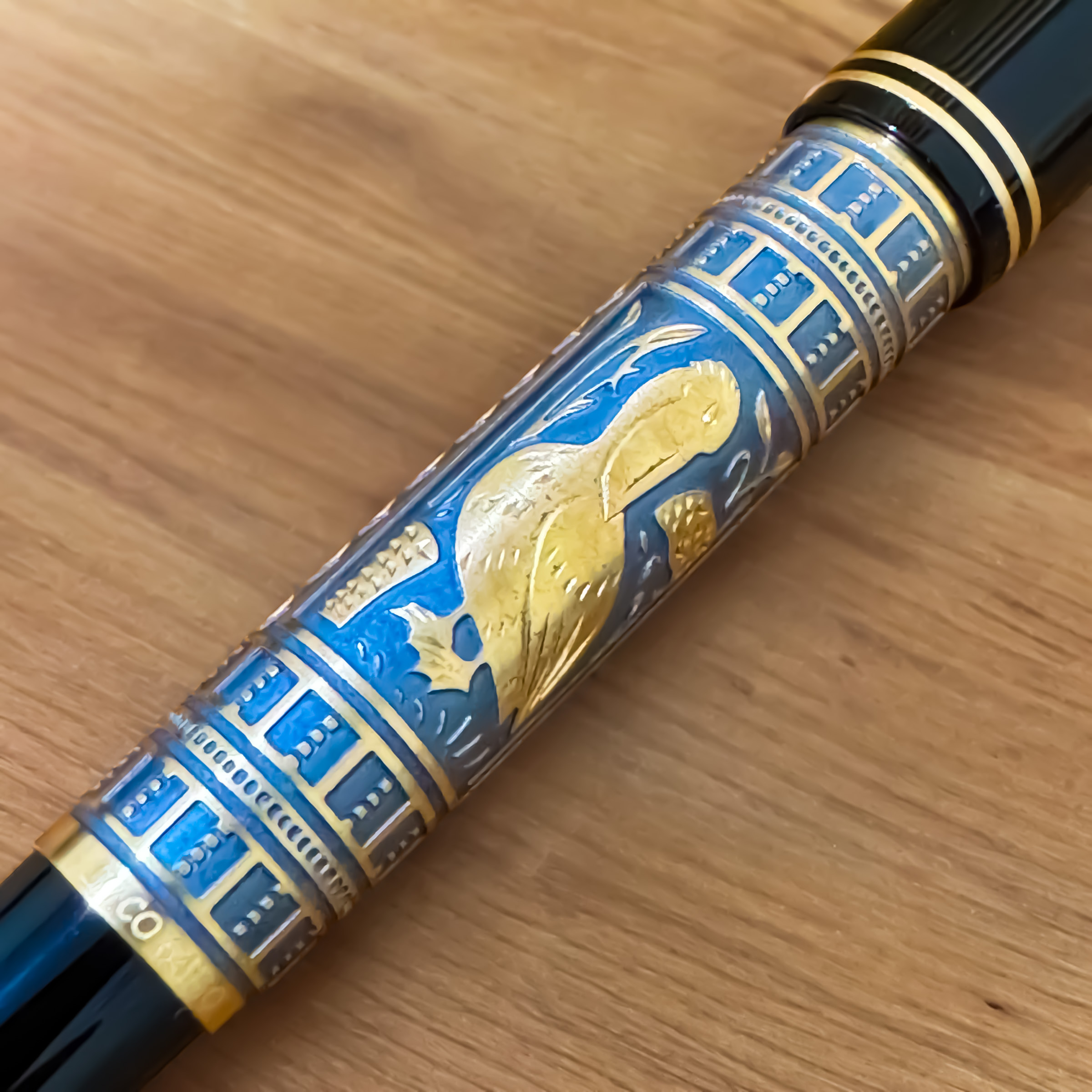
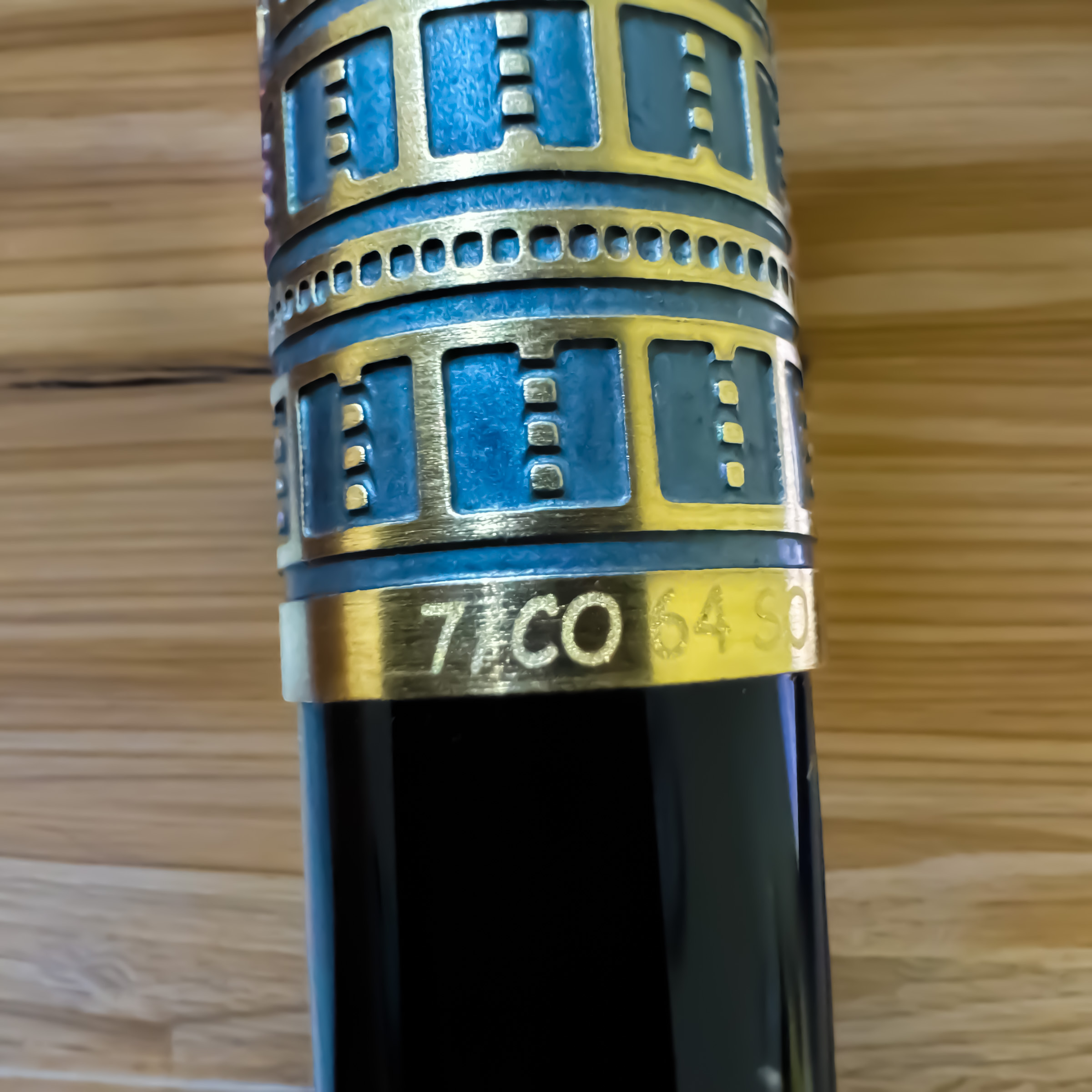
The pen’s cap and barrel are crafted from deep black resin, offering a pleasing weight and polish. The hardware is rendered in a warm bronze-coloured metal, subtly aged, which evokes the patina of ancient artefacts. The hieroglyphs engraved along the cap translate to “Montblanc” or more literally, “white mountain”, but unlike Montblanc’s usual bright white star emblem, the logo here is simply engraved into the bronze cap top—unobtrusive, respectful to the overall aesthetic, and perfectly in tune with the design’s restraint.

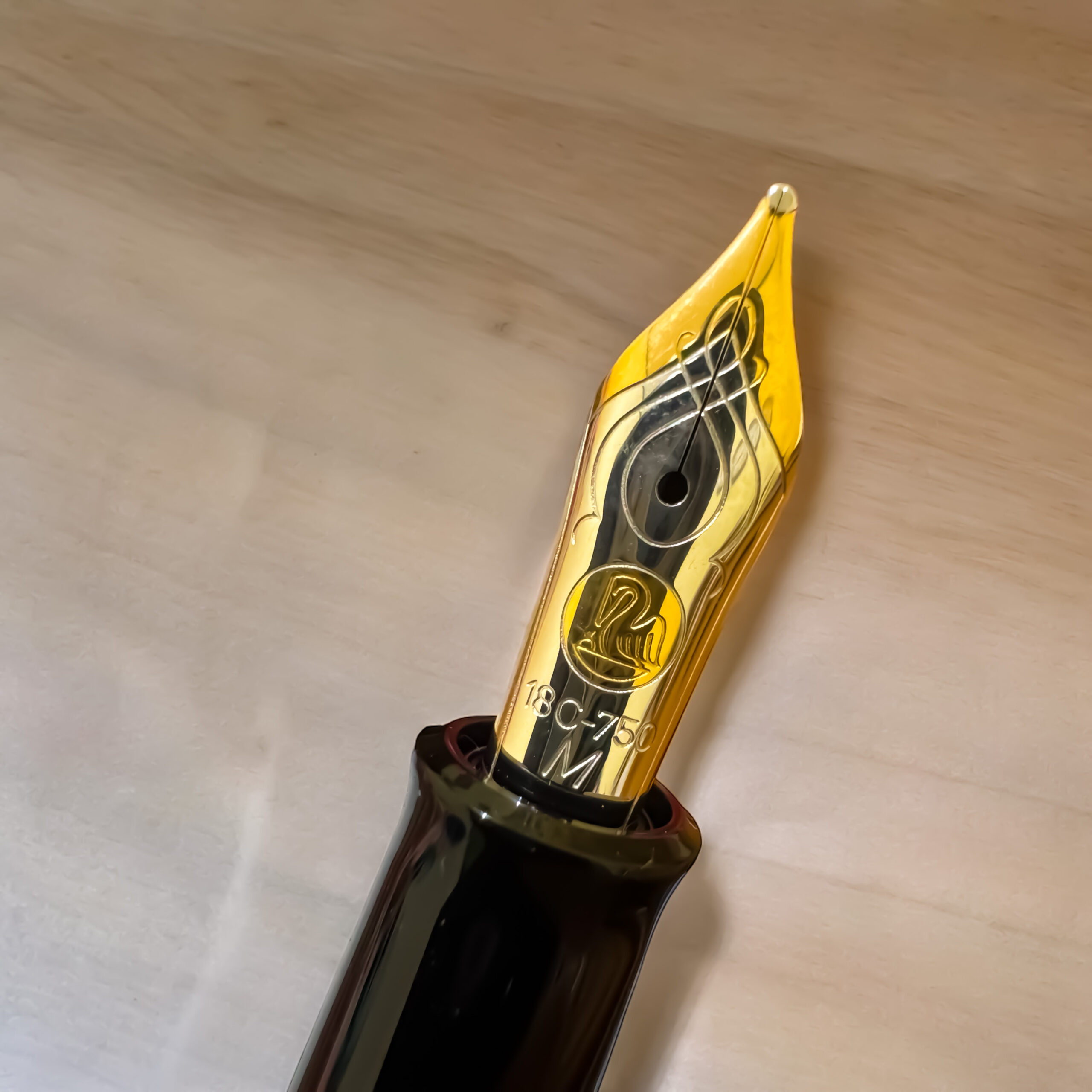
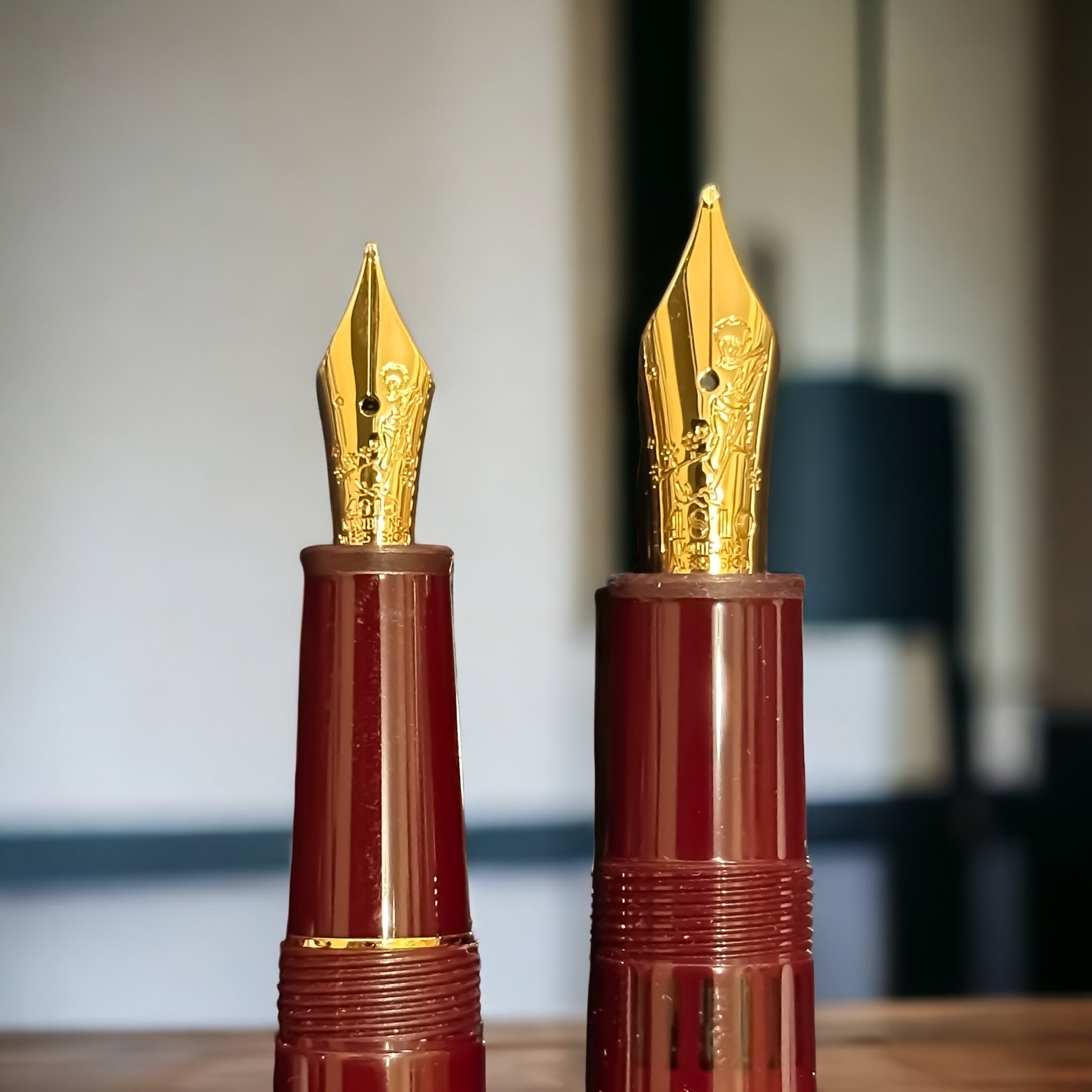
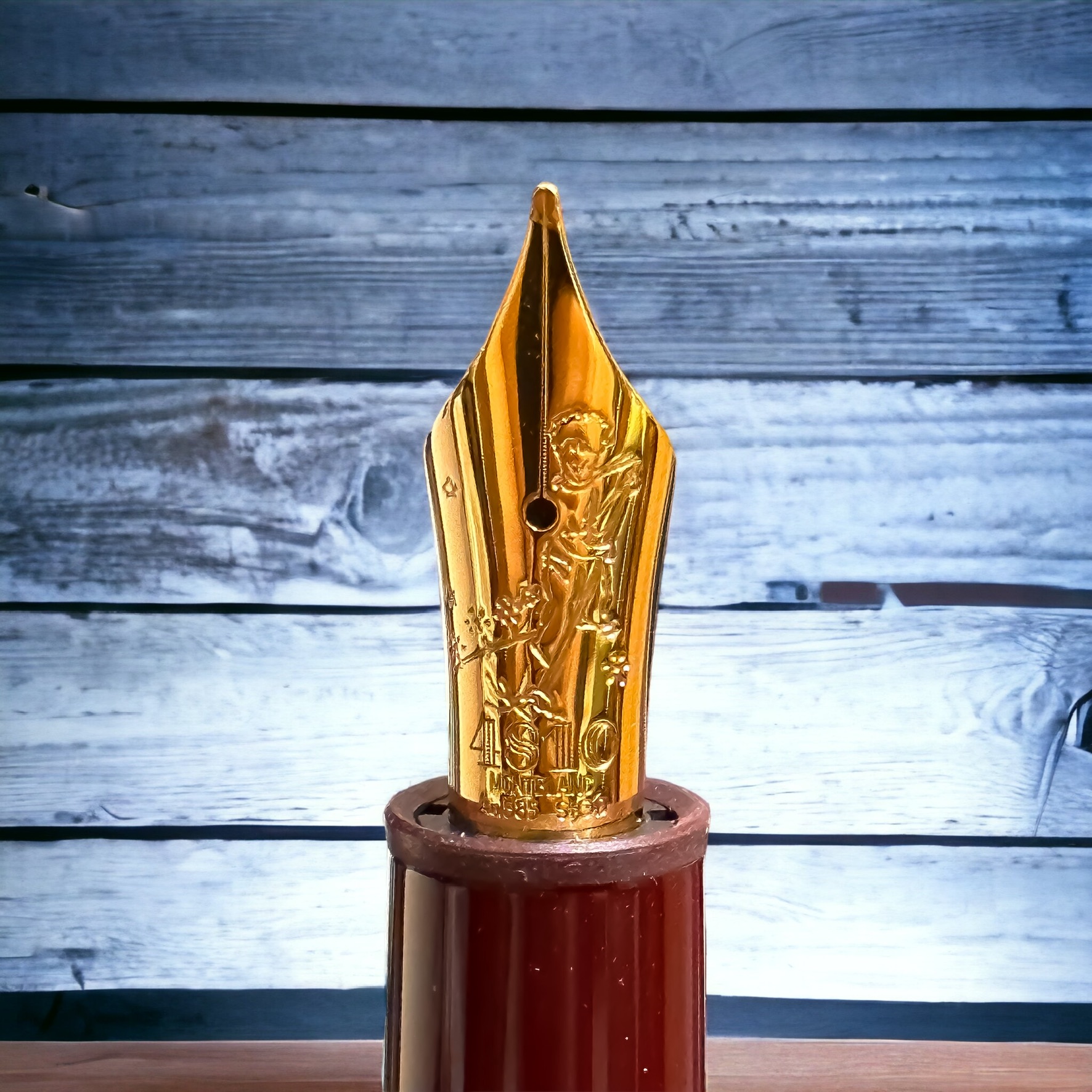
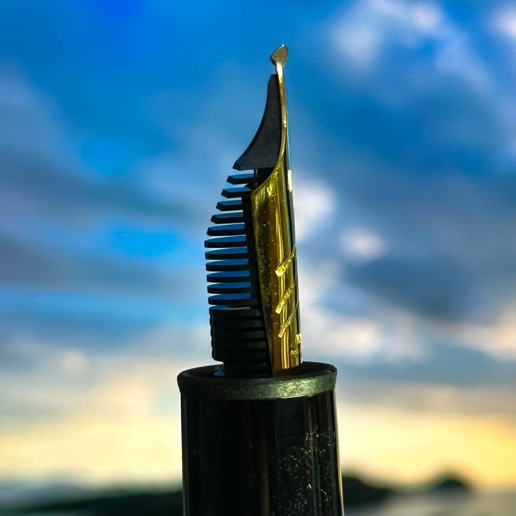
There is a symbolic richness in every detail. The clip is shaped like a stylised scarab beetle, one of the most iconic and spiritually resonant symbols in Egyptian iconography, representing renewal, rebirth, and the protection of the sun god Ra. On the Au750 solid gold nib—mine in a Fine size—Montblanc has engraved the crook and flail, the traditional regalia of the pharaohs, once held across the chest of Tutankhamun in his golden death mask. These motifs are not arbitrary; they reflect an intentional alignment with the core Egyptian values of wisdom, leadership, and eternity—elevating the pen from a writing tool into a portable emblem of timeless power.

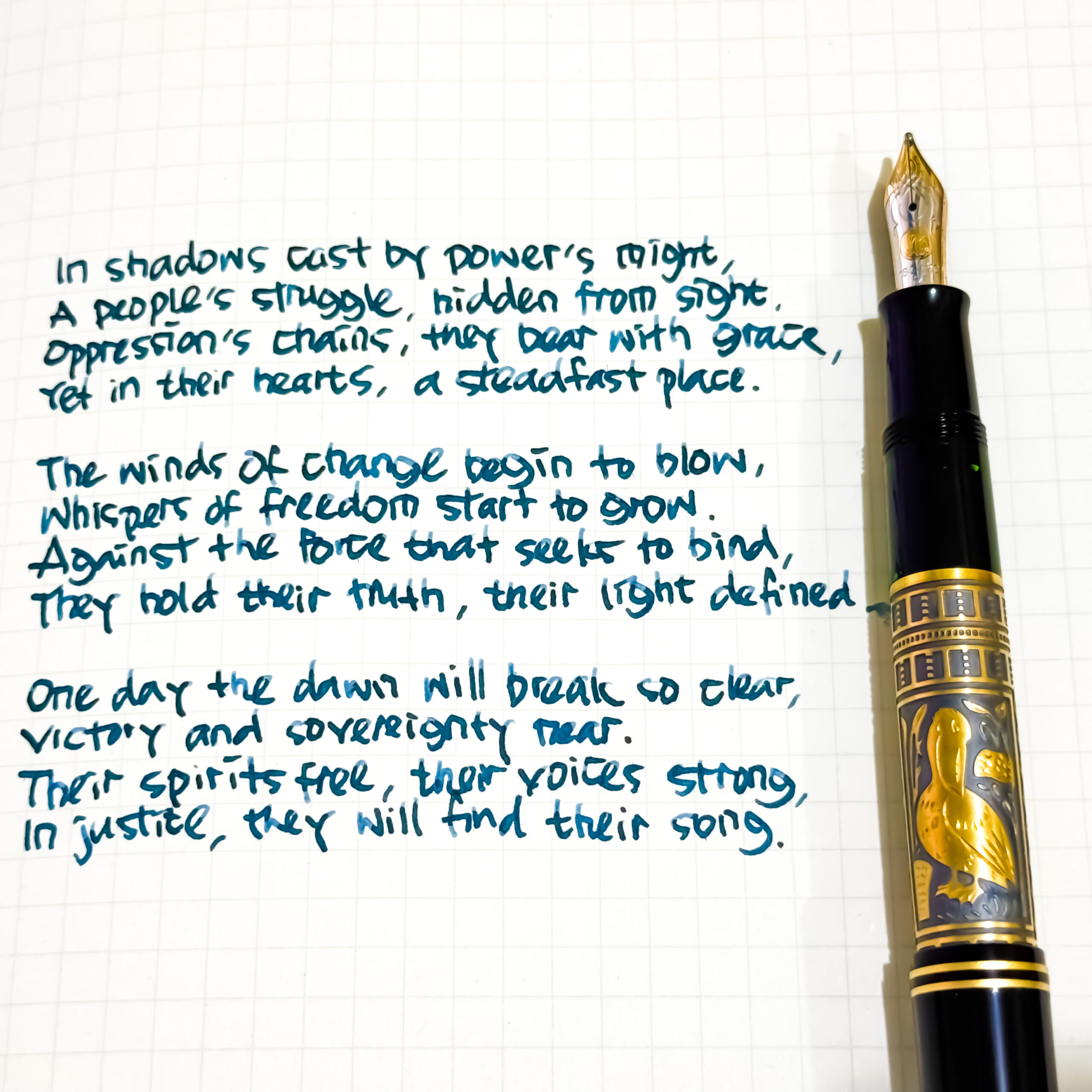
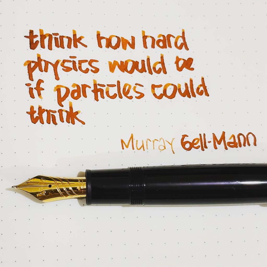
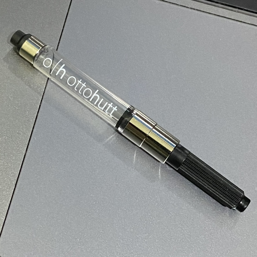
While its aesthetics are rich with meaning, the pen is also remarkably functional. Its slender profile makes it suitable for daily writing, and the Fine nib offers a precise, smooth stroke—ideal for taking notes in meetings, outlining concepts, or writing down structured thoughts, including technical ideas and programming logic. The piston filling mechanism, hidden within the resin body, is reliable and offers a generous ink capacity for those who write extensively. What I appreciate most is the feeling of balance in the hand—the pen sits firmly but lightly, never slipping, never fatiguing.

I chose this pen not because of its ornamentation, but rather for its clarity of design. It represents the kind of simplicity I value deeply—where nothing is unnecessary, and every line has purpose. The black and bronze colourway is both elegant and subtle, conveying seriousness without ostentation. The small hieroglyphic engraving feels like a secret shared with the past, and the absence of bright logos keeps the focus on the pen itself. I picked it up at Harrods in London, June last year. An indulgence, yes, but a meaningful one — a modest gift to myself. Since then, the Egyptomania has remained a constant companion in my work and travels. It feels less like an object and more like a fragment of a larger story—where the wisdom of the past meets the craft of the present, and where every stroke of ink connects thought, hand, and history.

Pelikan M700 Tolédo

In 1931, Pelikan adopted a technique of Damascus steel engraving into a design of its fountain pen. This method, brought to Spain by the Arabs and perfected in Tolédo, involves engraving patterns into steel or iron surfaces, overlaying them with a thin sheet of gold, and heating the object to oxidise the steel while leaving the gold to shine brilliantly​​. Today, Pelikan still uses this technique for two Souverän series: M700 and M900. The elegant M700 has arrived last week.

The M700 Tolédo features a decorative sleeve made from a single piece of 925 Sterling Silver, which is intricately hand-engraved and covered with a layer of gold. This results in a beautifully contrasting design that combines the dark oxidised silver with the luminous gold patterns. The cap, front piece, and end piece of the pen are crafted from high-quality black resin, adding to its overall elegance and durability​​.

Pelikan M700 Tolédo is similar in size to the Pelikan Souverän M400, with a length of approximately 12.5 cm when capped and 14.7 cm when posted. It has a comfortable weight of about 23 grams, making it well-balanced and easy to handle for prolonged writing sessions​​.

One of the most distinguished features of the M700 is its nib. The pen is equipped with an Au750 (18K gold) nib adorned with rhodium accents, available in various sizes. Mine has medium size. This bi-color nib not only enhances the pen’s aesthetic appeal but also ensures a smooth and pleasurable writing experience. The pen utilizes a high-capacity piston filling system, which is both efficient and easy to use​.

Each M700 fountain pen is a unique piece, individually designed, hand-signed, and numbered. The intricate hand-engraving process means that no two pens are exactly alike. Due to the extensive manual labor involved, only a limited number of these pens —up to 200— can be produced each month. This exclusivity adds to the pen’s allure as a collector’s item and a piece of art​.

The pen is presented in a luxurious silk-lined wooden gift box, adding to its prestige and making it an excellent choice for a cherished gift. This thoughtful presentation underscores Pelikan’s attention to detail and dedication to providing a premium product experience​.

M700 is not just a writing instrument — it is a piece of history. The pen’s design has remained virtually unchanged since its introduction, preserving the heritage and craftsmanship of the Tolédo technique. This makes owning a Tolédo M700 akin to owning a small piece of art history​.

Le Petit Prince #3 — Montblanc

As a personal joke, I call it an example of a cognitive dissonance, or specifically on the aspect of cognitions importance — the greater the perceived value of something, the greater the magnitude of the dissonance in the relation. The dissonance on the importance values result sometimes in unpredictable things. An example is the activity of collecting fountain pens (in the 21st century nonetheless). Another example is the cohesion to the books and other artefacts related to Le Petit Prince. That is the reason that I choose this very day to exhibit another, or two other, artefacts from both collections: Montblanc, Le Petit Prince Series of the 3rd Year, in burgundy.

I have also explored my other Montblanc pens collection related to Le Petit Prince:

Obviously, I skip MB The Meisterstück Le Petit Prince #3 on purpose — albeit an inapparent reason.

This Montblanc LPP Series #3 were launched in 2020, with burgundy colour, and with gold nibs (Au 585) carved with The Little Prince cleaning his planet from the sprouts of bad seeds. The Chapter 5 of Le Petit Prince book describes on the little prince’s planet, as on all planets, there were good plants and bad plants, and so of course there were good seeds from the good plants, and bad seeds from the bad plants. But seeds are invisible. They lie dormant hidden deep in the dark of the earth until one of them has the notion it would be a good idea to wake up. This little seed will first have a stretch, then grow slowly, ever so slowly, up towards the sunlight, until at last there it is, a sweet little innocuous twig of a plant. If it is the first shoot on a radish perhaps, or the early sprig of a rose, then it can be left to grow on as it wishes. But if this is a bad plant, you should pull it up at once, the moment you recognise it for what it is. “It’s just a question of self discipline,” the little prince explained later.

I have two size of this excellently designed pen: Le Grand (146 size, above) and the Classique (145 size, below). The Meisterstück 146 is larger and has a slightly thicker barrel compared to the Meisterstück 145. The 146 is often considered a full-sized pen, while the 145 is slightly smaller and more compact. Both have similar nib design, albeit with obviously different size, and consequently different detail. The 146 has an internal piston, while the 145 is equipped with a cartridge.

Having two fountain pens with different size and similar design makes it easier to compare the experience of using these quite standardised pen (in term of size). Since the Meisterstück 146 is larger, it tends to be slightly heavier than the Meisterstück 145. The weight difference is generally not substantial, but some individuals may have a preference for either a lighter or heavier pen. While both pens offer a smooth writing experience, some users find that the larger size of the Meisterstück 146 provides a more comfortable grip and balance. However, this can vary based on personal preference and hand size.

The the previous Le Petit Prince -themed pens, these pens were designed in collaboration with Antoine de Saint-Exupéry’s Estate. Le Petit Prince, authored by Antoine de Saint-Exupéry, is a beloved and timeless literary work that has captivated readers worldwide. Montblanc’s collaboration with the Estate of Antoine de Saint-Exupéry allows them to pay homage to the author and his iconic characters while creating a special connection with literature enthusiasts and fans of Le Petit Prince.

Surely we are all curious that Montblanc released three different pen designs related to Le Petit Prince in three consecutive years. Or four, if the pen released in 2017 to commemorate Antoine de Saint-Exupéry is also counted. But releasing the pens in different colours each year has successfully created a sense of exclusivity and limited edition allure. It can also incentivise collectors to acquire all three pens (at least), appealing to the desire to complete a set or collection. This approach allows Montblanc to tap into the passion and enthusiasm of collectors who seek to possess the entire series. Each new colour or design release also keeps the story and its themes fresh in the minds of fans, fostering a continued connection with the narrative. And this is why I started it with a mention of cognitive dissonance.

Le Petit Prince #4 — Montblanc

Today we celebrate the 80th anniversary of the first publication of The Little Prince. On April 6, 1943, the first edition of the book was published in the United States, featuring illustrations created by the author, Antoine de Saint-Exupéry. The book tells the story of a young prince who travels from one planet to another, encountering various characters and learning profound life lessons along the way.

The Little Prince was met with immediate critical acclaim and gained a dedicated readership. Despite being initially published in wartime, it managed to capture the hearts of readers around the world with its enchanting storytelling and philosophical themes. It is important to note that the first publication of The Little Prince was in English, not in its original French language. The French edition followed later, published posthumously in 1946.

Since its publication, “The Little Prince” has become one of the most translated and best-selling books in the world, captivating readers of all ages with its poignant exploration of human nature, love, friendship, and the beauty of the imagination. It continues to be celebrated as a literary masterpiece and a cherished work of art.

The mesmerising nib with the rose

For the celebration, I display here a Montblanc Le Petit Prince series that I haven’t previously displayed. It is a special edition! The nib, made from Au750 (18K gold), is delicately engraved with the image of a rose. The rose holds significant symbolism in The Little Prince as it represents the bond between the Prince and his beloved rose. In the story, the rose is a delicate and special flower that teaches the Prince important lessons about love, responsibility, and the complexities of relationships. The rose engraving on the nib of this pen captures this iconic symbol, adding a touch of elegance and meaning to the writing instrument.

Writing with MB LPP Burgundy edition
The starry cap

Meisterstück 149 Curved Nib

Happy handwriting day. Today I’d like to share another special pen: another Meisterstück Calligraphy 149 pen from Montblanc, but now with a specially-designed curved nib. Its hand-crafted nib is not a flex nib, but an innovative curved nib allowing the user to draw a variety of writing styles and line widths, depending on the angle and the orientation at which the pen is held.

Using this pen, we can draw wide horizontal lines, thin vertical lines, and even fine lines. For the last style, we need to turn the nib upside down.

The nib is unlike any bent or fude nib, but I was tempted to use it to write some kanji and katakana character, and I found the result is better than many other pen I previously have. I would not display the result here, since I’m not a real master in writing kanji character.

Otto Hutt Design 04

Otto Hutt Design 04 is a notable and highly regarded series of writing instruments by the German manufacturer Otto Hutt. Introduced in 1999, Design 04 has become synonymous with the brand’s commitment to craftsmanship, innovative design, and luxurious aesthetics.

Otto Hutt is a German manufacturer known for producing high-quality writing instruments, including fountain pens. The company was founded in 1920 by Karl Hutt in Pforzheim, Germany. Initially, the company focused on creating jewelry and accessories, including gold and silver pens. During the 1950s, Otto Hutt expanded its production to include more affordable writing instruments while maintaining its dedication to quality. The company incorporated advancements in pen technology and materials, such as the use of new plastics and metals, to cater to a wider market. In the 1990s, Otto Hutt underwent a significant transformation under the leadership of Dr. Christa Hutt, the granddaughter of the founder. Driven by a vision of combining traditional craftsmanship with contemporary aesthetics, she revitalised the brand’s focus on luxury pens. This led to the introduction of the “Design 04” series in 1999, which gained widespread acclaim for its sleek and innovative design.

The Design 04 series is characterised by its sleek and modern design, combining clean lines with sophisticated details. It uses premium materials — the collection includes options crafted from precious metals, such as sterling silver and gold, as well as high-quality lacquers and resins. These materials not only enhance the pen’s aesthetic appeal but also contribute to its durability and longevity. The Design 04 pens are available in a range of finishes, allowing users to select a style that suits their personal preferences. Some of the finishes include precious metals with polished or brushed textures, vibrant lacquers in various colors, and elegant combinations of materials. The finishes are meticulously applied to ensure a flawless and visually captivating appearance.

The Design 04 series offers a selection of finely crafted nibs, designed to deliver an exceptional writing experience. The nibs are available in different materials, such Au750 (18k gold) shown here, and in various widths to cater to individual writing preferences. Each nib is carefully tuned to provide smooth and consistent ink flow, resulting in effortless and enjoyable writing.

Otto Hutt is known for its attention to detail, and the Design 04 series exemplifies this commitment. From the precision-engineered threads to the meticulously finished clips and accents, every aspect of the pen is thoughtfully designed and executed.