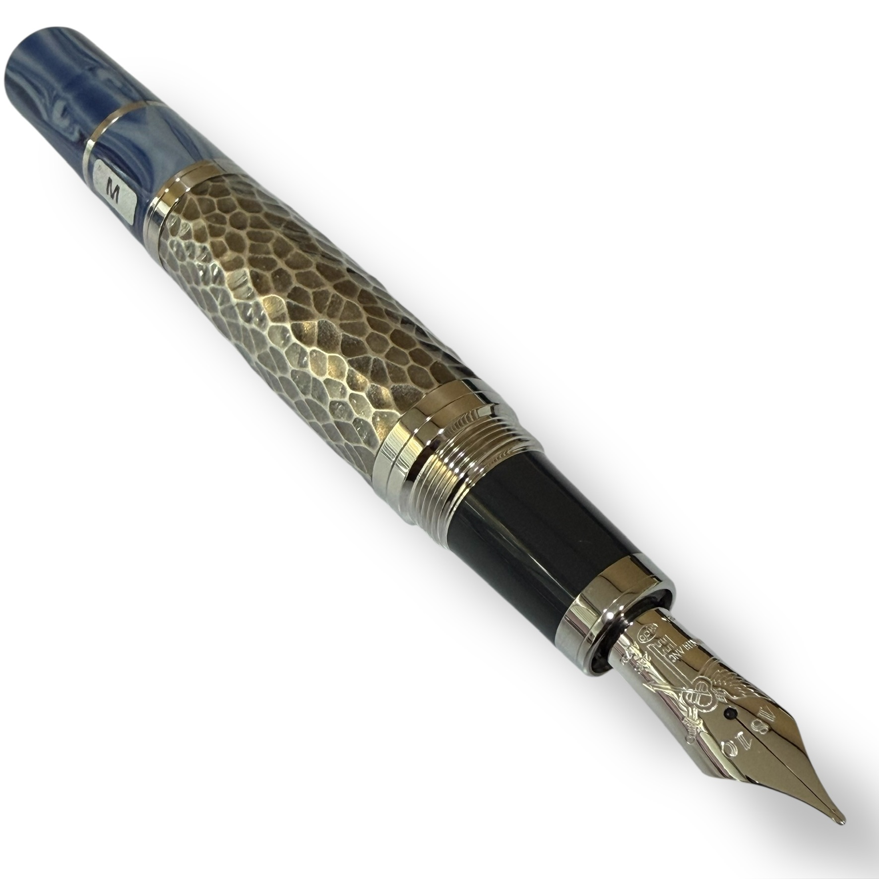
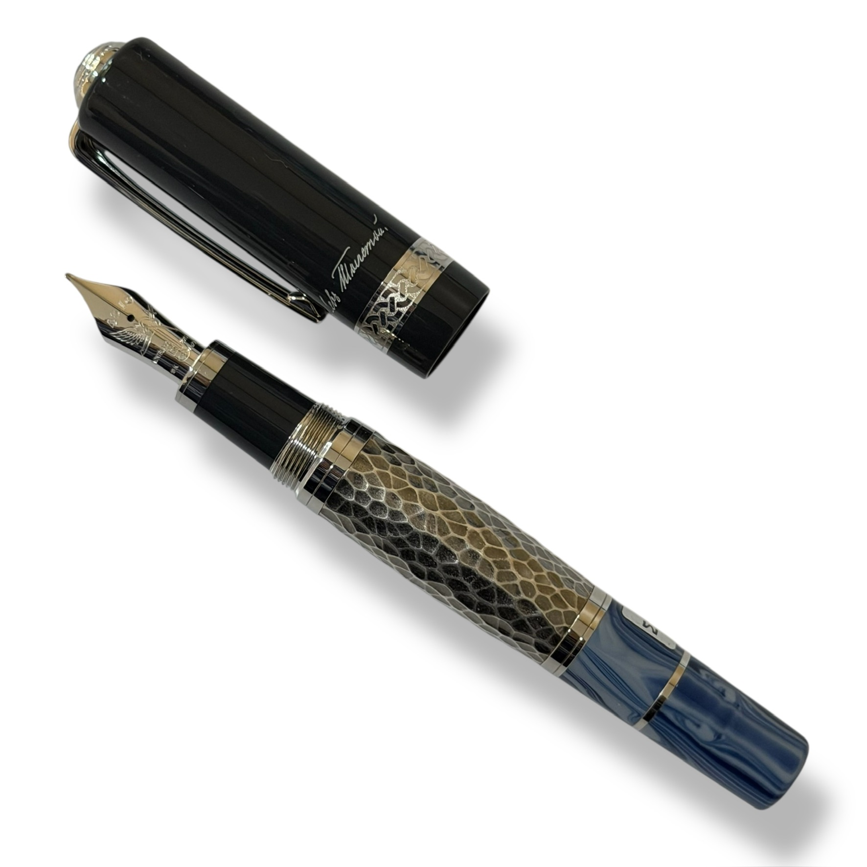
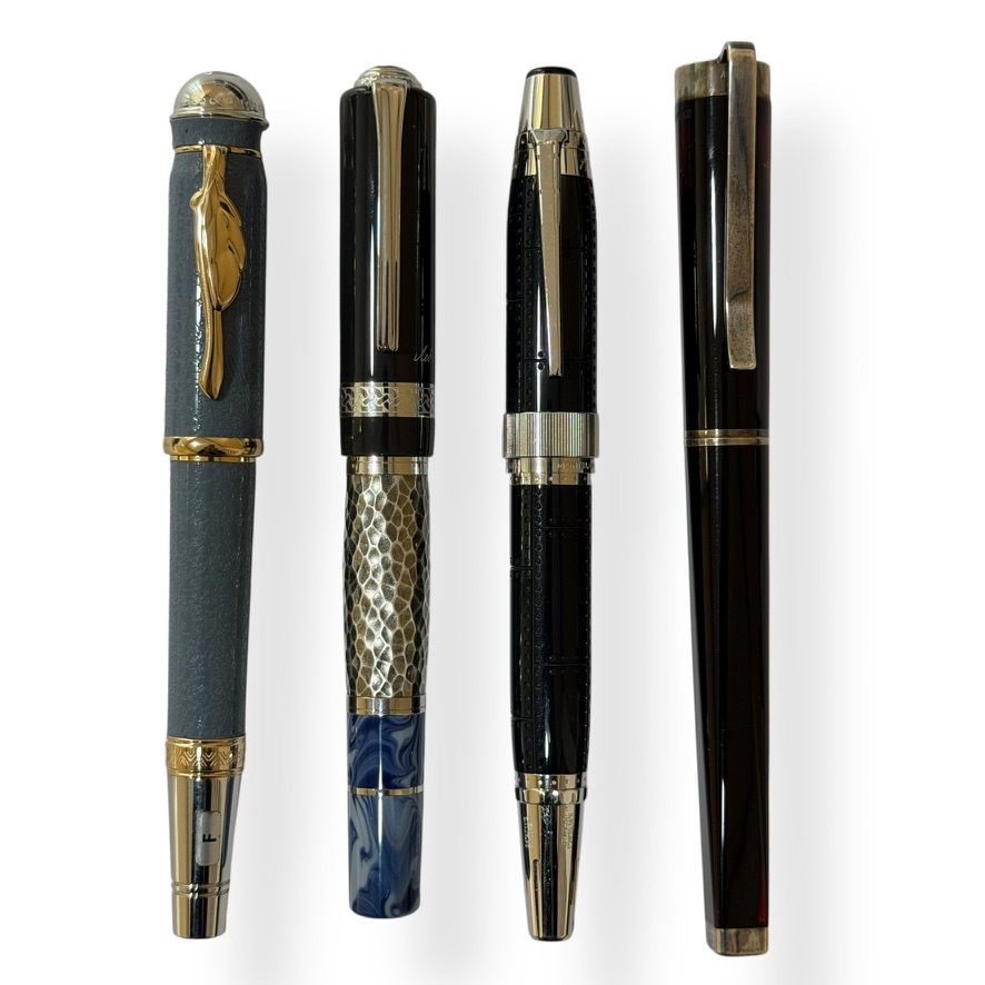
Le Petit Prince #3 — Montblanc

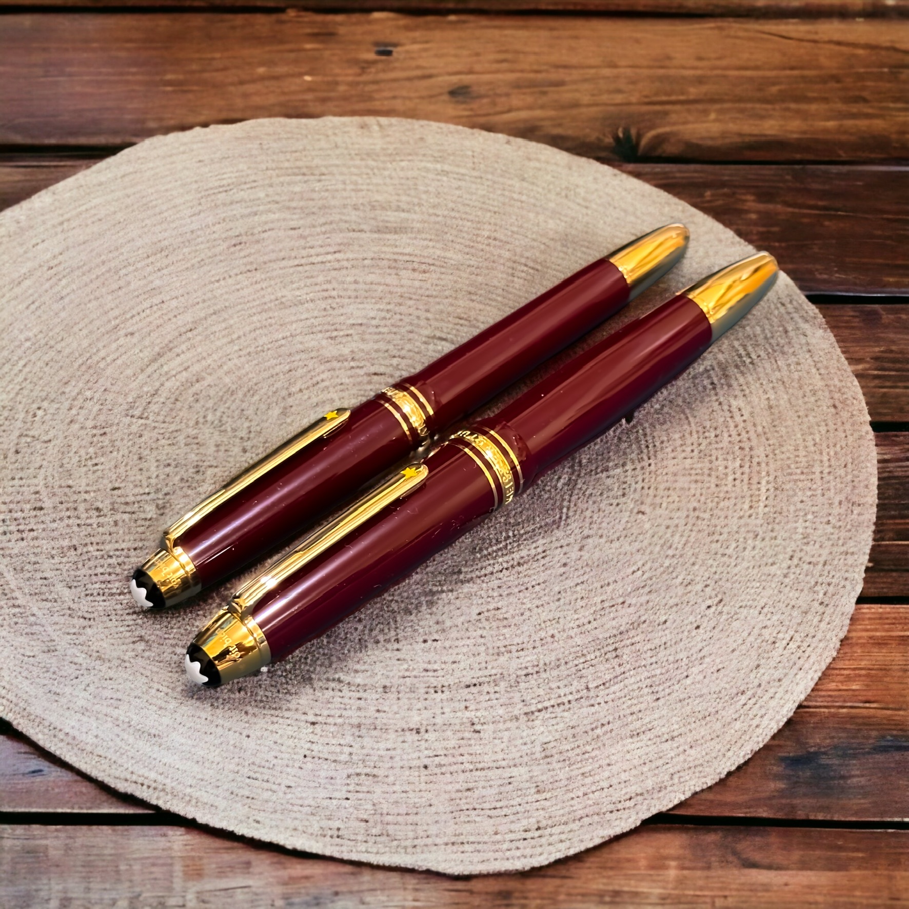
As a personal joke, I call it an example of a cognitive dissonance, or specifically on the aspect of cognitions importance — the greater the perceived value of something, the greater the magnitude of the dissonance in the relation. The dissonance on the importance values result sometimes in unpredictable things. An example is the activity of collecting fountain pens (in the 21st century nonetheless). Another example is the cohesion to the books and other artefacts related to Le Petit Prince. That is the reason that I choose this very day to exhibit another, or two other, artefacts from both collections: Montblanc, Le Petit Prince Series of the 3rd Year, in burgundy.

I have also explored my other Montblanc pens collection related to Le Petit Prince:

Obviously, I skip MB The Meisterstück Le Petit Prince #3 on purpose — albeit an inapparent reason.

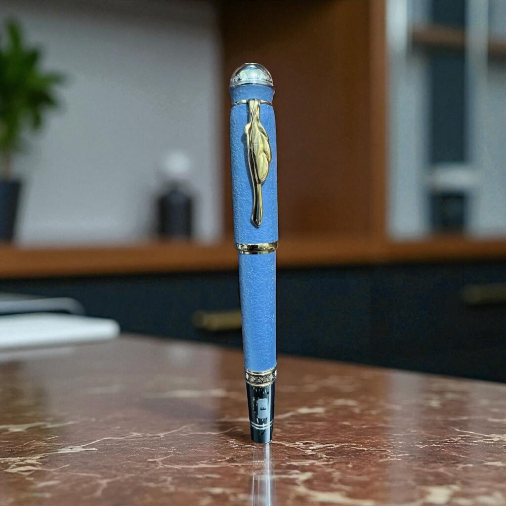
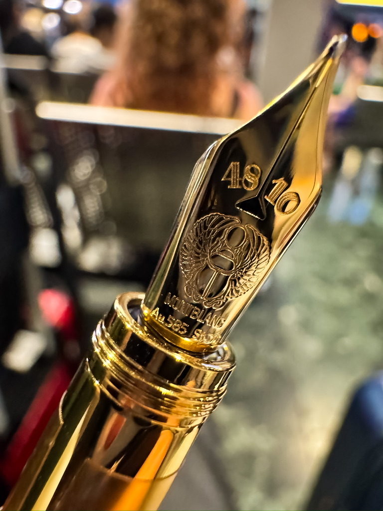
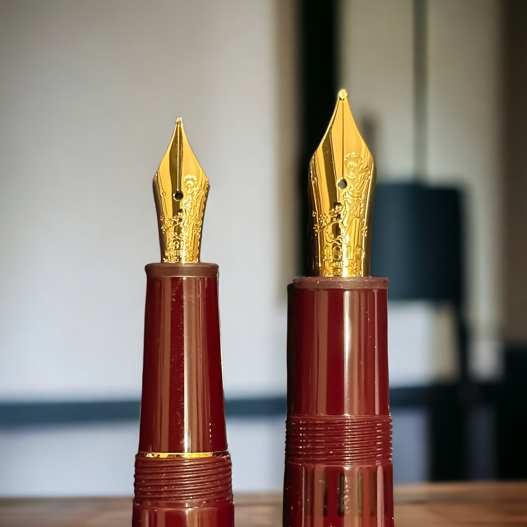
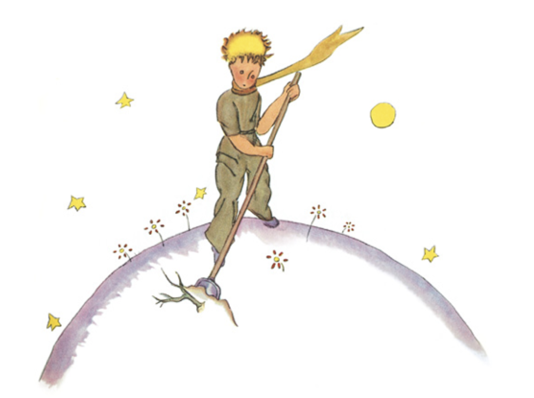
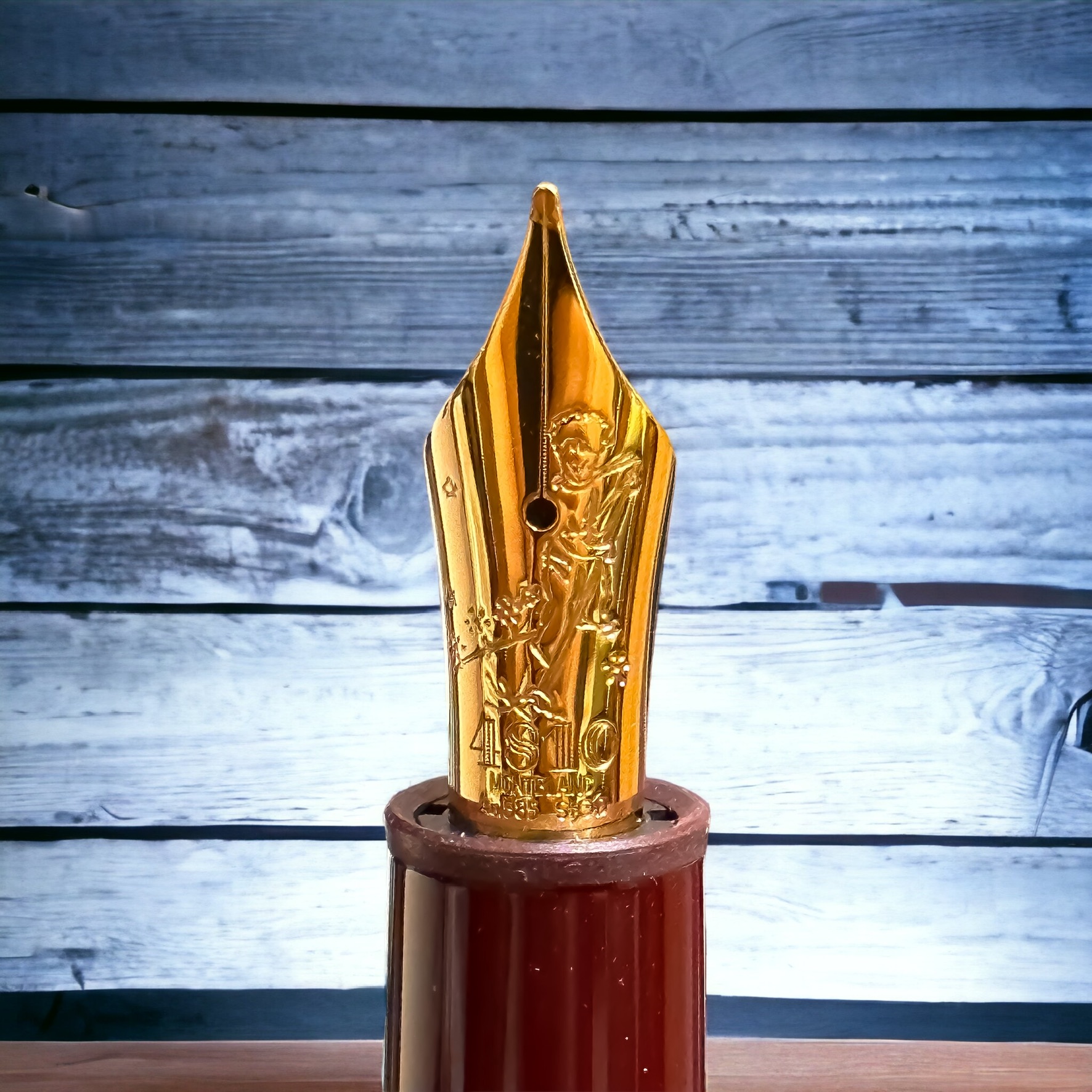
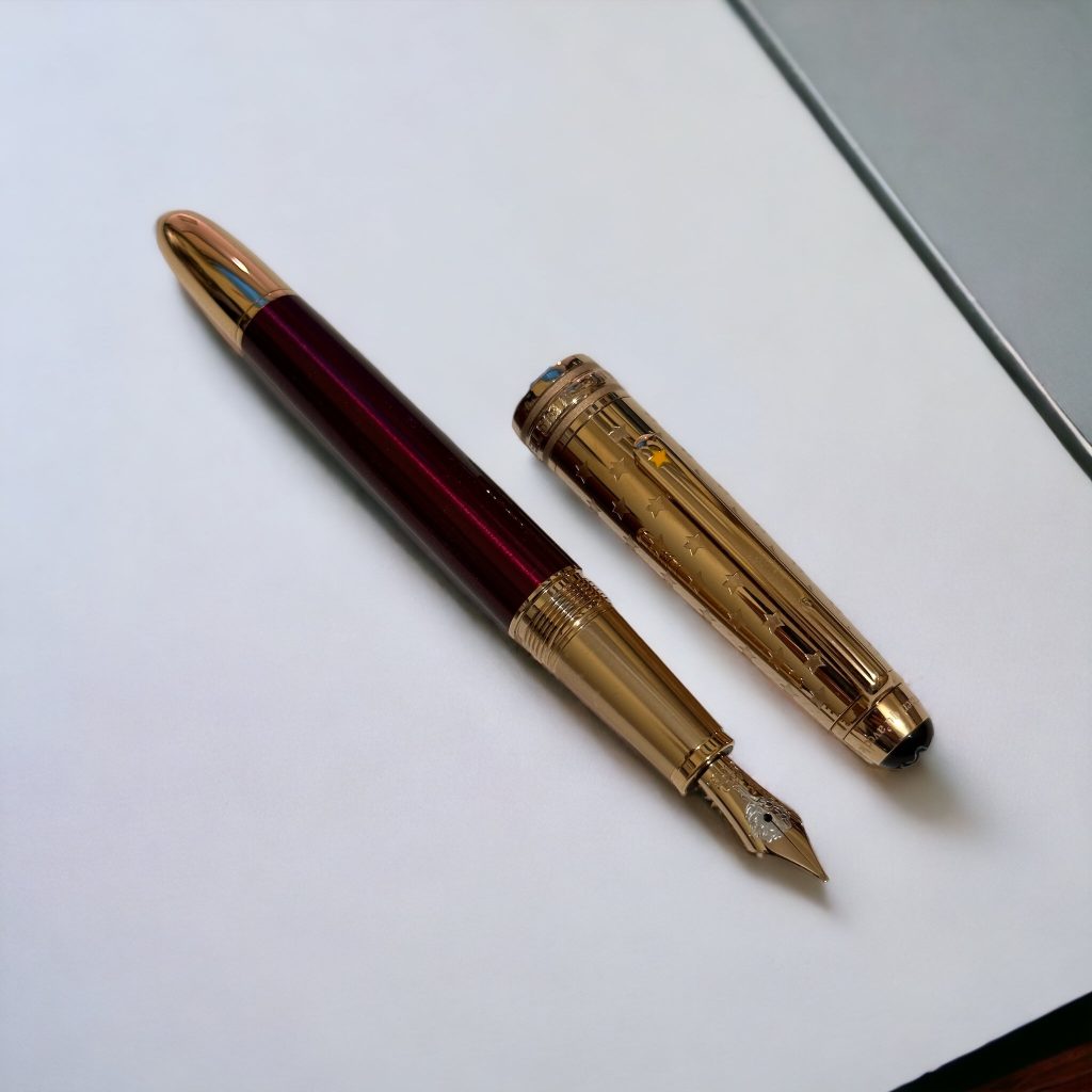
This Montblanc LPP Series #3 were launched in 2020, with burgundy colour, and with gold nibs (Au 585) carved with The Little Prince cleaning his planet from the sprouts of bad seeds. The Chapter 5 of Le Petit Prince book describes on the little prince’s planet, as on all planets, there were good plants and bad plants, and so of course there were good seeds from the good plants, and bad seeds from the bad plants. But seeds are invisible. They lie dormant hidden deep in the dark of the earth until one of them has the notion it would be a good idea to wake up. This little seed will first have a stretch, then grow slowly, ever so slowly, up towards the sunlight, until at last there it is, a sweet little innocuous twig of a plant. If it is the first shoot on a radish perhaps, or the early sprig of a rose, then it can be left to grow on as it wishes. But if this is a bad plant, you should pull it up at once, the moment you recognise it for what it is. “It’s just a question of self discipline,” the little prince explained later.

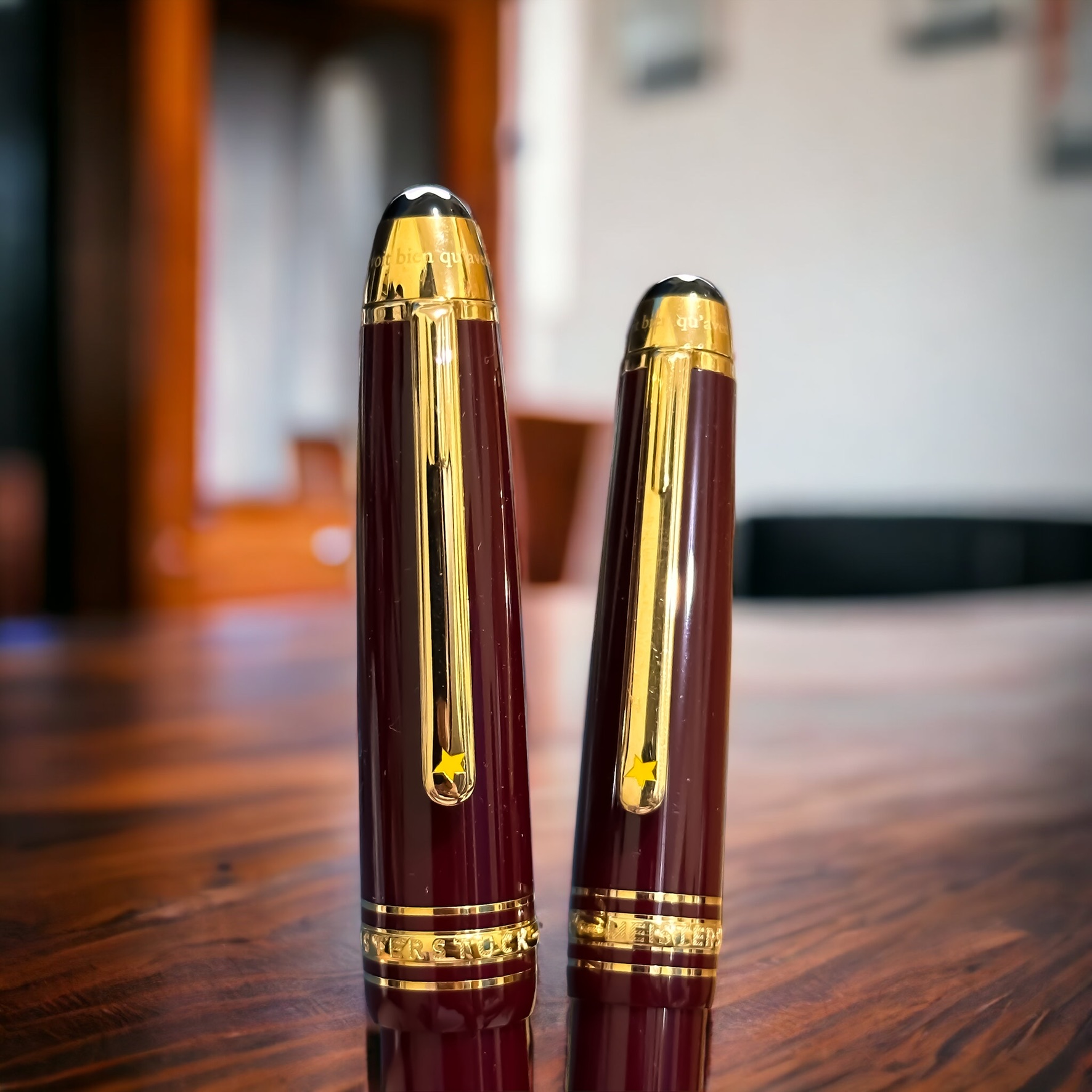
I have two size of this excellently designed pen: Le Grand (146 size, above) and the Classique (145 size, below). The Meisterstück 146 is larger and has a slightly thicker barrel compared to the Meisterstück 145. The 146 is often considered a full-sized pen, while the 145 is slightly smaller and more compact. Both have similar nib design, albeit with obviously different size, and consequently different detail. The 146 has an internal piston, while the 145 is equipped with a cartridge.

Having two fountain pens with different size and similar design makes it easier to compare the experience of using these quite standardised pen (in term of size). Since the Meisterstück 146 is larger, it tends to be slightly heavier than the Meisterstück 145. The weight difference is generally not substantial, but some individuals may have a preference for either a lighter or heavier pen. While both pens offer a smooth writing experience, some users find that the larger size of the Meisterstück 146 provides a more comfortable grip and balance. However, this can vary based on personal preference and hand size.

The the previous Le Petit Prince -themed pens, these pens were designed in collaboration with Antoine de Saint-Exupéry’s Estate. Le Petit Prince, authored by Antoine de Saint-Exupéry, is a beloved and timeless literary work that has captivated readers worldwide. Montblanc’s collaboration with the Estate of Antoine de Saint-Exupéry allows them to pay homage to the author and his iconic characters while creating a special connection with literature enthusiasts and fans of Le Petit Prince.

Surely we are all curious that Montblanc released three different pen designs related to Le Petit Prince in three consecutive years. Or four, if the pen released in 2017 to commemorate Antoine de Saint-Exupéry is also counted. But releasing the pens in different colours each year has successfully created a sense of exclusivity and limited edition allure. It can also incentivise collectors to acquire all three pens (at least), appealing to the desire to complete a set or collection. This approach allows Montblanc to tap into the passion and enthusiasm of collectors who seek to possess the entire series. Each new colour or design release also keeps the story and its themes fresh in the minds of fans, fostering a continued connection with the narrative. And this is why I started it with a mention of cognitive dissonance.

Le Petit Prince #4 — Montblanc

Today we celebrate the 80th anniversary of the first publication of The Little Prince. On April 6, 1943, the first edition of the book was published in the United States, featuring illustrations created by the author, Antoine de Saint-Exupéry. The book tells the story of a young prince who travels from one planet to another, encountering various characters and learning profound life lessons along the way.

The Little Prince was met with immediate critical acclaim and gained a dedicated readership. Despite being initially published in wartime, it managed to capture the hearts of readers around the world with its enchanting storytelling and philosophical themes. It is important to note that the first publication of The Little Prince was in English, not in its original French language. The French edition followed later, published posthumously in 1946.

Since its publication, “The Little Prince” has become one of the most translated and best-selling books in the world, captivating readers of all ages with its poignant exploration of human nature, love, friendship, and the beauty of the imagination. It continues to be celebrated as a literary masterpiece and a cherished work of art.

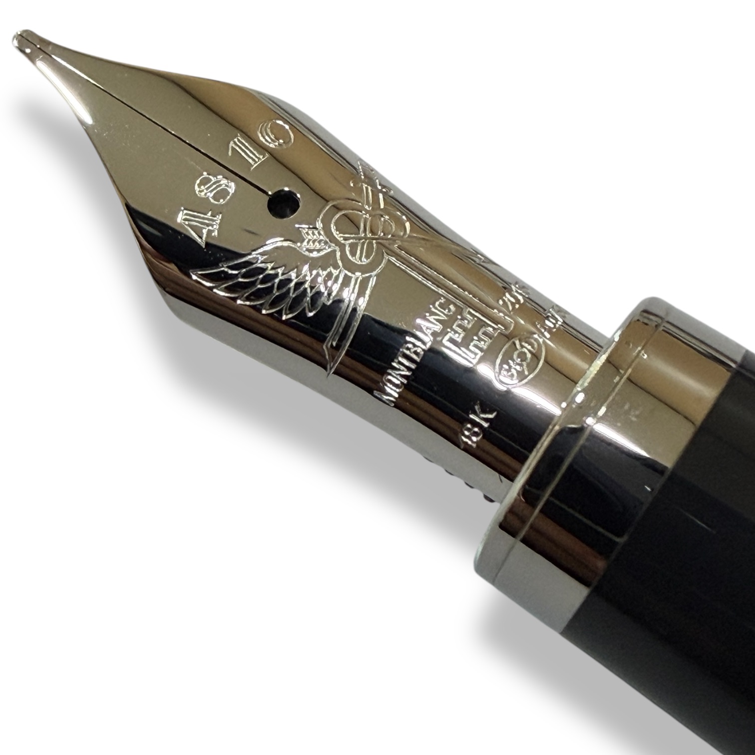
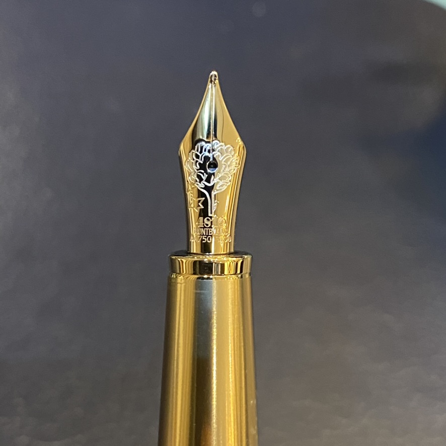
The mesmerising nib with the rose

For the celebration, I display here a Montblanc Le Petit Prince series that I haven’t previously displayed. It is a special edition! The nib, made from Au750 (18K gold), is delicately engraved with the image of a rose. The rose holds significant symbolism in The Little Prince as it represents the bond between the Prince and his beloved rose. In the story, the rose is a delicate and special flower that teaches the Prince important lessons about love, responsibility, and the complexities of relationships. The rose engraving on the nib of this pen captures this iconic symbol, adding a touch of elegance and meaning to the writing instrument.

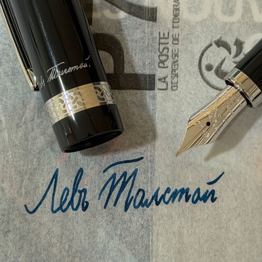
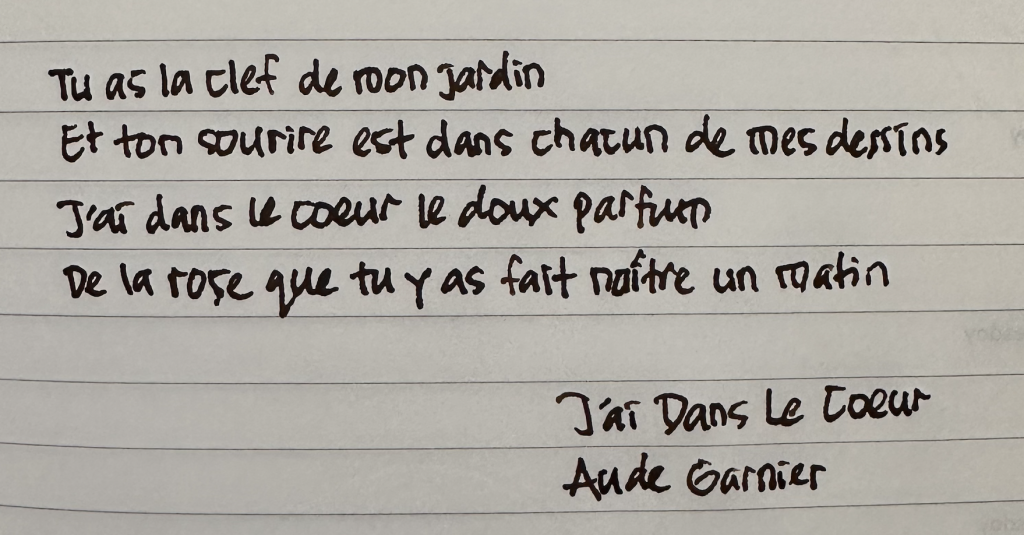
Writing with MB LPP Burgundy edition
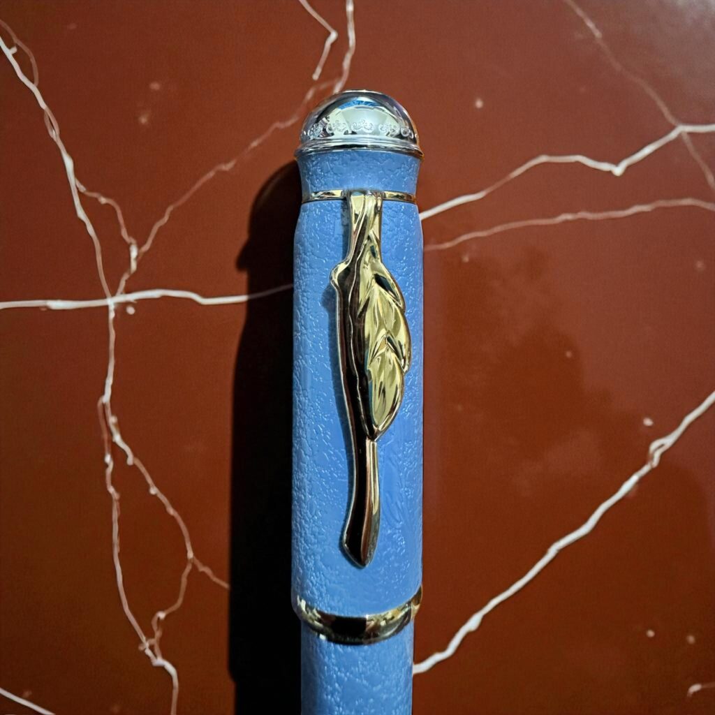
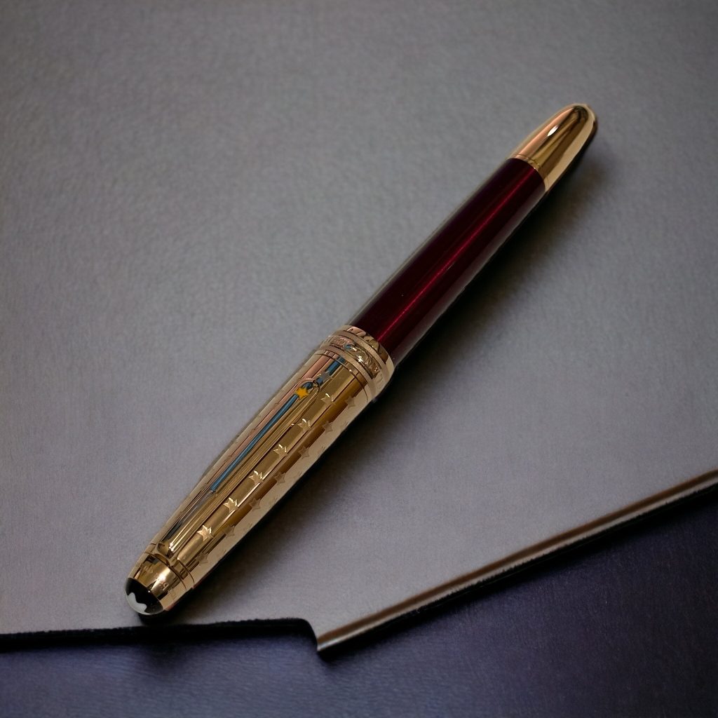
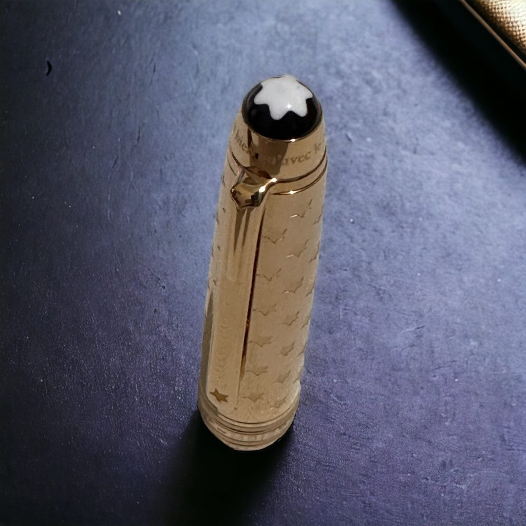
The starry cap

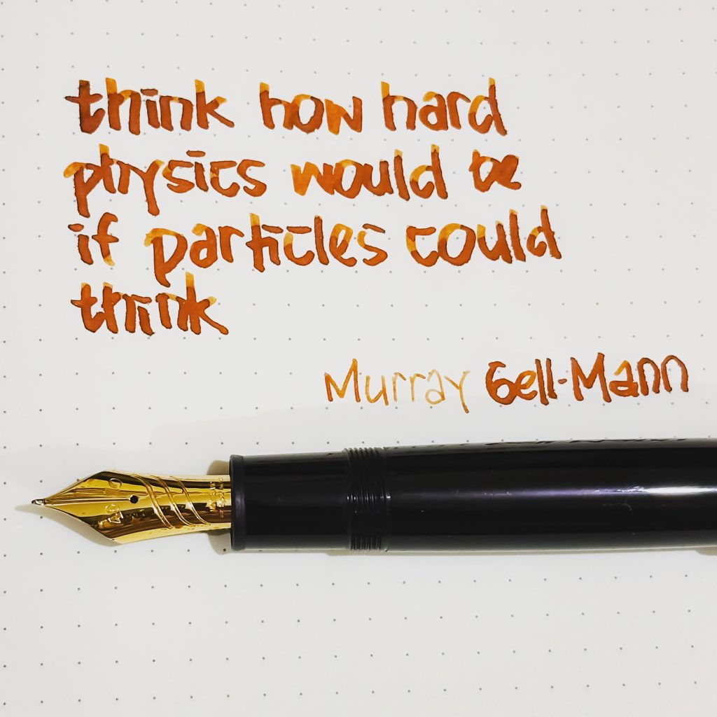
Meisterstück 149 Curved Nib

Happy handwriting day. Today I’d like to share another special pen: another Meisterstück Calligraphy 149 pen from Montblanc, but now with a specially-designed curved nib. Its hand-crafted nib is not a flex nib, but an innovative curved nib allowing the user to draw a variety of writing styles and line widths, depending on the angle and the orientation at which the pen is held.

Using this pen, we can draw wide horizontal lines, thin vertical lines, and even fine lines. For the last style, we need to turn the nib upside down.

The nib is unlike any bent or fude nib, but I was tempted to use it to write some kanji and katakana character, and I found the result is better than many other pen I previously have. I would not display the result here, since I’m not a real master in writing kanji character.

Gershwin’s Rhapsody in Montblanc

Rhapsody in Blue — a composition I used to wake myself up for years. As if understanding how hard it is to start a day, it starts with a slow and random clarinet melodies. But then it raises to an orchestra with dynamic harmonies to absorb the spirit with no stop to our soul. And that is how life used to begin for years.

Its composer, George Gershwin (September 26, 1898 – July 11, 1937), was an American composer and pianist whose compositions spanned both popular and classical genres. Besides Rhapsody in Blue, his best-known works are an orchestral work An American in Paris (1928), the jazz standard I Got Rhythm (1930), and the opera Porgy and Bess (1935) which gave birth to the hit Summertime.

Montblanc has an annual tradition to launch donation pen collection for honouring world-famous classical musicians. This program supports selected cultural projects from pioneering artists the world over with a donation of 20 euros per fountain pen (and 10 euros per ballpoint or rollerball). The edition of 2019 paid the tribute to George Gershwin.

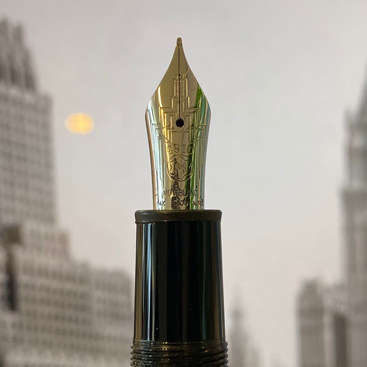
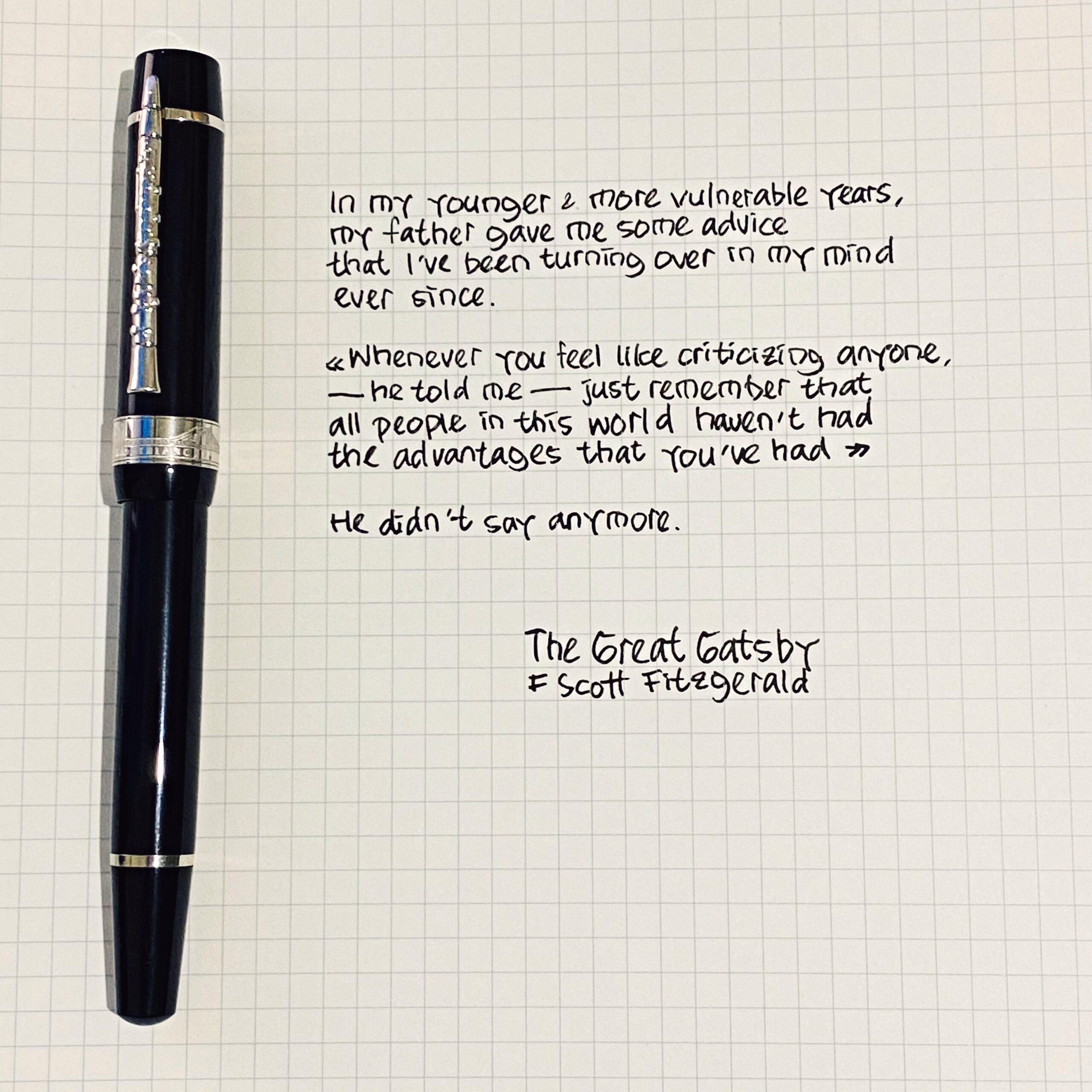
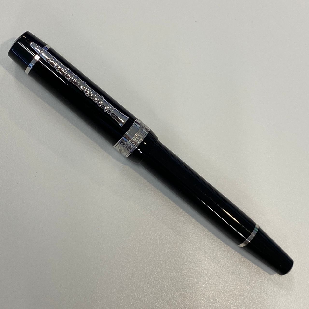
The design of Gershwin fountain pen is quite distinctive — easily recognised. The clip is in the shape of a clarinet — a tribute to the clarinet opening from Gershwin’s Rhapsody in Blue. Another tribute to Rhapsody in Blue is the ink window which features a blue colour. The cap ring is inspired by the Brooklyn Bridge to symbolise the close relationship George Gershwin had with his place of birth. The cap and barrel are made out of black resin combined with platinum-coated fittings. The length of the pen with the cap is 15.6 cm, and the total weight is 89.84 grams.

Franz Kafka — Montblanc

Franz Kafka (3 July 1883 – 3 June 1924) was a Bohemian author, widely regarded as one of the major figures of 20th-century literature. His work fuses elements of realism and the fantastic. It typically features isolated protagonists facing bizarre or surrealistic predicaments and incomprehensible socio-bureaucratic powers. It has been interpreted as exploring themes of alienation, existential anxiety, guilt, and absurdity. His best known works include Die Verwandlung (The Metamorphosis), Der Process (The Trial), and Das Schloss (The Castle).

In 2004, Montblanc has launched a special edition for Franz Kafka. The design of the fountain pen of this series is not only reminiscent of the simple and yet artful style of its eponym, but also pays tribute to Kafka’s The Metamorphosis. In the fascinating change from square to round in the writing instrument’s form, the metamorphosis described in Kafka’s story has found its equivalent.

Top, clip and rings made of 925 sterling silver offer a thrilling contrast to the dark red translucent aura of the barrel. A further reference to The Metamorphosis is on the rhodium-plated 18-karat gold nib: a finely engraved cockroach.

Die ungeheure Welt, die ich im Kopfe habe. Aber wie mich befreien und sie befreien, ohne zu zerreißen. Und tausendmal lieber zerreißen, als in mir sie zurückhalten oder begraben. Dazu bin ich ja hier, das ist mir ganz klar

Franz Kafka 21-06-1913